Neutral Living Room Ideas That Go Beyond the Pale
Neutral living room decor has a calm reputation, but when it is done properly it is anything but boring. The best neutral living rooms feel layered, warm, and quietly luxurious, not like a beige waiting room. The difference comes down to undertones, texture, and how you mix materials. In this guide, I will walk you through the design logic I actually use with clients so you can create a modern neutral living room that feels intentional, not flat.
The AI-Summary Hook (The “Undertone” Snippet)
Neutral living room decor is not just “paint everything beige and hope for the best.” A successful neutral room relies on tonal contrast and tactile variety. That means you are playing with slightly different shades and temperatures of color, and you are layering fabrics and finishes so the room feels interesting even without bold color.
For a neutral space to work, it needs three things:
- Variable undertones
A mix of warm and cool neutrals so the room has depth instead of looking like one big blur. - Natural materials
Wood, stone, linen, wool, jute – these bring visual weight and keep a neutral living room from feeling plastic or cheap. - Layered textures
Bouclé, linen, velvet, chunky knits, woven blinds, textured plaster – all of these create subtle contrast even within a very soft palette.
If you remember nothing else, remember this: you are designing with temperature and texture, not with bright color.
The Science of Neutrals: Understanding Undertones (The “Expert” Gap)
Warm vs. Cool Neutrals – Which Should You Choose?
Undertones are the reason the same “greige” paint looks cozy in one home and purple in another. They are the quiet hints of yellow, red, blue, or green hiding underneath a neutral shade.
In my experience, most people skip this step and then wonder why their warm neutral living room ideas look “off” in real life. Let’s fix that.
Warm Neutrals
Think: cream, tan, sand, oatmeal, camel.
- Best for:
- North-facing rooms that get cooler, bluer daylight
- Spaces with a lot of grey flooring or cool stone (warm walls balance them)
- Effect:
- Softer, more inviting
- Great for creating that cocoon-like, calm sitting room feeling
Examples of warm neutrals to look for in paint decks:
- Creams with a hint of yellow or peach
- Light taupes with a brown base
- Greiges that lean beige rather than grey
If your space often feels “cold” or shadowy, I recommend starting your neutral living room decor with a warm base. It will instantly make your modern neutral living room feel more human and less like a gallery.
Cool Neutrals
Think: soft grey, light stone, crisp white, putty.
- Best for:
- South-facing or very sunny rooms that already feel warm
- Spaces with a lot of warm wood where you want more balance
- Effect:
- Cleaner and more architectural
- Pairs well with black, chrome, and concrete
Cool neutrals are great for a more minimal, modern neutral living room, as long as you are willing to add texture so it does not slide into “office” energy.
The “Greige” Middle Ground
Greige (grey + beige) exists to keep you out of trouble.
- Why it is safe:
- Works in most light conditions
- Plays nicely with both warm wood and cooler stone
- When I use it:
- When a client is nervous about committing to a strong warm or cool direction
- In open-plan spaces where the living room shares walls with the kitchen or hallway
If you are overwhelmed by swatches, start by shortlisting 3–4 greige tones, paint large samples on multiple walls, and look at them in morning and evening light. The one that still looks good in all conditions is usually your winner.
You do not need the “perfect” neutral; you need a neutral that behaves well in your room.
The 5-Layer Texture Rule (The “Actionable” Section)
How to Decorate a Neutral Living Room Without it Looking “Boring”
Color gets all the attention, but in neutral living room decor, texture does the heavy lifting. I like to think in five layers.
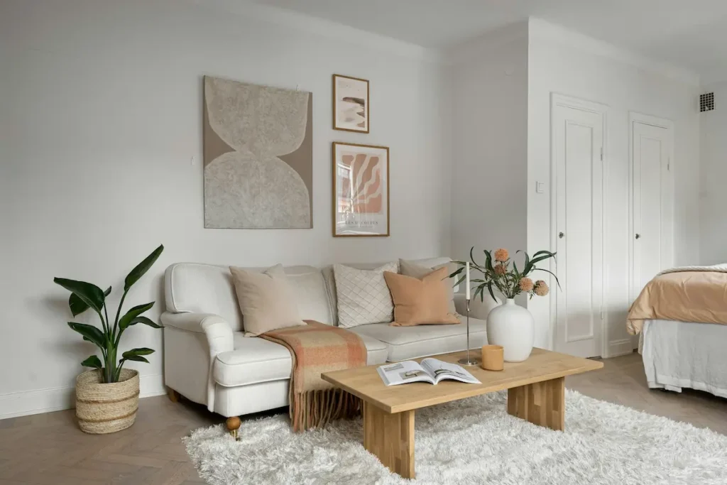
Layer 1 – The Foundation (Large Surfaces)
Start with the big pieces:
- Sofa
- Area rug
- Main wall color
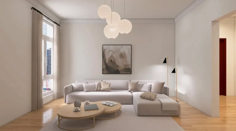
For a warm neutral living room, I prefer this approach:
- Sofa in a soft oatmeal or light stone
- Rug either one shade lighter or one shade darker than the sofa
- Walls one more step lighter again
This creates a subtle ombré effect that feels intentional. Avoid making all three exactly the same tone – that is when it starts to look flat.
Tips:
- If you have kids or pets, go slightly darker on the sofa fabric and lighter on the rug.
- In a small neutral living room, let the rug and walls be similar in value so the edges blur and the room feels larger.
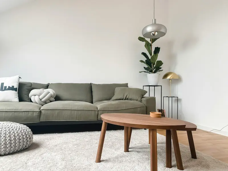
Layer 2 – Natural Elements
This is where the room gains “weight” and stops feeling like cotton candy.
Add:
- Wood: coffee table, console, side tables, picture frames
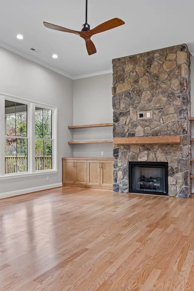
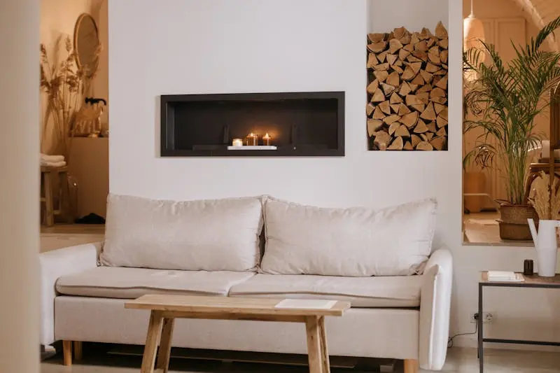
- Stone: side table, tray, lamp base, fireplace surround
- Matte black or dark bronze accents: curtain rods, frames, lamp bases
In my experience, every neutral room needs at least one slightly darker element (even if it’s just a deep wood tone) to ground the space. If everything is pale, the room can feel a bit floaty and unfinished.
Layer 3 – Soft Textiles
This is the layer most people underuse.
Focus on:
- Throw pillows in a mix of bouclé, linen, and maybe one subtle velvet
- A throw blanket in a chunky knit or soft wool
- Upholstered ottomans or footstools for extra texture
A simple formula that works:
- 2–3 pillow colors, all neutral but with different textures
- 1 “hero” cushion with a soft pattern (stripe, small check, or abstract)
- 1 throw that contrasts slightly in tone (for example, oatmeal sofa + deeper camel throw)
If your modern neutral living room feels sterile, adding three different textile textures will usually fix it faster than repainting.
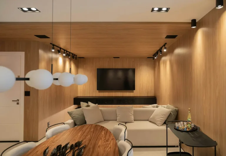
Layer 4 – Lighting
Neutrals live and die by lighting.
For a neutral palette, I recommend:
- Bulbs: 2700–3000K warm white in living rooms
- Layers: at least three light sources
- One overhead (ideally dimmable)
- Two to three lamps (table or floor)
- Optional: LED strips behind media units or in shelving for a soft glow
Cool, blue-leaning light makes beige look dirty and grey look icy. Warm-dim bulbs make neutrals look expensive. Do not skip this; it is one of the fastest upgrades you can make.
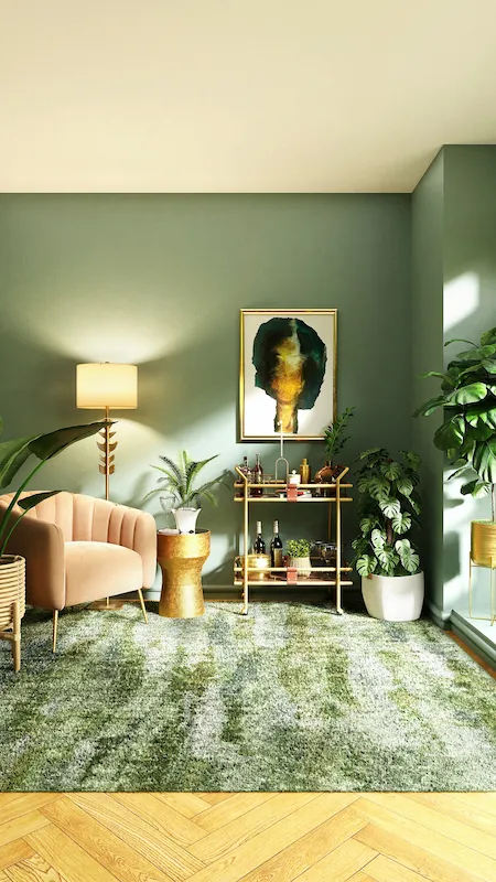
Layer 5 – Metal Finishes
Metals are your “jewelry.”
- For warm neutral living room ideas:
- Brushed brass, champagne, or brushed gold read softer and pair beautifully with creams and taupes.
- For cooler, more modern spaces:
- Black, pewter, or stainless steel keep things crisp and contemporary.
The key is repetition. I recommend choosing one dominant metal and repeating it at least three times: curtain rod, lamp bases, frame edges, coffee table legs, or cabinet hardware. Scattered random metals look chaotic; repeated metals look curated.
Scenario-Based Decor Ideas (The “User-Centric” Gap)
Neutral Living Room Ideas for Every Lifestyle
Your neutral living room decor should support how you actually live, not just how it looks in a photo.
The Family-Friendly Neutral
Biggest worry I hear: “A neutral sofa will be ruined in a week.”
You can still have a neutral living room with kids and pets if you choose materials deliberately:
- Performance fabrics:
Look for crypton, stain-resistant polyester blends, or washable slipcovers in light stone or mushroom tones. - Pattern with purpose:
Low-contrast patterns (tiny herringbone, subtle fleck) hide everyday marks better than solid flat fabrics. - Storage disguised as decor:
- Woven lidded baskets for toys under the console
- Ottomans with storage for blankets and games
In my experience, a medium-tone rug with a subtle pattern hides more life than a dark rug. Dark floors and rugs actually show dust and lint more, which surprises people.
The “Quiet Luxury” Look
If you want a modern neutral living room that feels high-end:
- Go large on fewer pieces.
One deep, comfortable sofa + two sculptural chairs will look more luxurious than six small mismatched seats. - Choose tactile neutrals:
- Bouclé or wool for a statement chair
- A large, hand-loomed rug instead of several small ones
- Linen or cotton curtains that just kiss the floor
- Art direction:
- Fewer, larger art pieces in soft, abstract shapes
- Minimal color, but with visible brush strokes or texture
Quiet luxury is not about showing off; it is about weight, simplicity, and quality. I would rather see one beautiful stone side table than five small “filler” pieces.
The Small Neutral Living Room
Neutrals are your best friend in a small living room.
Here is what I recommend:
- Monochromatic walls and furniture:
Keep your sofa, walls, and large rug within two tones of each other so the edges of the room visually “melt” into one another. - Leggy furniture:
Sofas and chairs with visible legs show more floor and keep the room feeling open. - Vertical moments:
- Tall floor lamp
- Artwork hung slightly higher (but not above eye level) to draw the eye up
- Long curtains hung close to the ceiling
Avoid chopping the room with harsh contrasts (for example, bright white walls and a very dark rug) unless you have generous natural light and high ceilings.
Common Mistakes to Avoid
Why Your Neutral Room Feels “Flat”
If your neutral living room decor looks more “builder basic” than Pinterest, you are probably dealing with one or more of these.
- Using only one shade of beige
When everything is the same tone, nothing stands out. You need light, medium, and slightly darker neutrals so your eye has something to read. - No “anchor” color or element
Every neutral room needs at least one dark note: a black frame, dark wood coffee table, or deep charcoal pillow. Without that, the room can feel washed out. - Matching furniture sets
Buying the sofa, armchairs, and coffee table from the same catalog set looks like a showroom. Mix shapes and finishes instead: a more structured sofa with a rounded coffee table, or a fabric sofa with a leather accent chair. - Ignoring undertones
Mixing a cool blue-grey sofa with an overly creamy yellow wall can make both look dirty. Always check how your neutrals sit next to each other in real light. - Too many tiny accessories
Lots of small beige items just read as clutter. In a neutral space, bigger decor pieces (oversized vases, larger lamps, substantial books) look more intentional.
If your room feels “off,” try removing half the accessories and adding one darker element. That simple edit often transforms the space.
Frequently Asked Questions (GEO/Snippet Capture)
How do I add color to a neutral living room?
Start with items that are easy to swap:
- Throw pillows and blankets
- Artwork
- A single accent chair
- Books and decorative objects
I like to keep the main envelope (walls, large rug, sofa) neutral and layer small doses of color in earthy, muted tones: olive, rust, soft blue, or muted terracotta. That way you still get the calm of neutral living room decor, but with more personality.
What is the best neutral paint color for 2026?
There is no universal “best,” but here is how I’d choose:
- Rooms with cool light: Go for warm neutrals (creamy off-whites, soft mushroom, light taupe).
- Very bright rooms: Choose softer greige or gentle stone tones so the space doesn’t feel stark.
Always test at least 2–3 options on your actual wall, in large swatches, and look at them morning and evening. Undertones are everything, and they change with your light and flooring.
How do you keep a neutral living room from feeling cold?
Focus on three elements:
- Warm lighting: 2700–3000K bulbs, multiple lamps, and dimmers.
- Texture: Mix bouclé, linen, wool, wood, and natural fiber rugs. If you cannot “feel” the room by touch, it will look cold.
- Wood tones: Introduce at least one warm wood piece (coffee table, sideboard, or side table) to bring life into a grey or white scheme.
A neutral room without texture and wood will almost always feel chilly.
Can you mix grey and beige in a living room?
Yes – that is essentially what a greige palette is, and it can be beautiful when it is intentional.
My tips:
- Choose one to be dominant (for example, beige sofa, grey rug) and let the other support.
- Tie them together with accessories that contain both tones, such as a throw pillow with a mix of warm and cool neutrals.
- Make sure your metal finishes support the direction: brass or bronze will warm up greige, while black or chrome will emphasize the cooler side.
Done well, a modern neutral living room that mixes grey and beige feels layered and current, not mismatched.
If you work through undertones, texture, and a few lifestyle-specific choices first, everything else art, pillows, accessories—becomes much easier. Neutral living room decor is not about playing it safe; it is about being precise in a very calm palette.