Living Room Wall Decor Ideas: Layouts, Rules & Trends (2026 Guide)
Empty walls make a room feel unfinished, but cluttering them makes it feel chaotic. The secret is knowing the “Rules of Scale”.
In this guide to Living Room Wall Decor Ideas: Layouts, Rules & Trends, I want to walk you through the same layout logic I use in client projects, so you can stop guessing and start hanging things with confidence. Effective living room wall decor relies on the 57-Inch Rule (hanging art at eye level), the Two-Thirds Rule (art should be 2/3 the width of the furniture below it), and balancing visual weight across the room.
We’ll look at each wall “zone” one by one, talk numbers (not just vibes), and then layer on 2026-friendly trends like textural pieces, modern rustic wall art, and renter-friendly tricks that won’t cost you your deposit.
The “Zone” Strategy: Decorating by Location
Before you buy anything, decide which zone you’re working on. The same piece can look perfect above a console and completely wrong above a sofa simply because the proportions change.
Think in four zones:
- Above the sofa
- The TV wall
- The “dead” corner
- The large empty wall
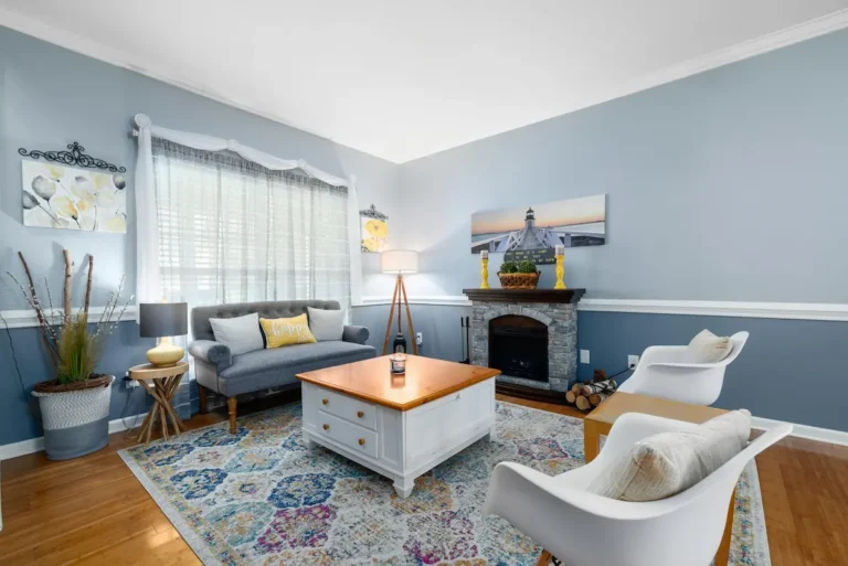
Above the Sofa
This is usually the main wall in the room, so what you hang here sets the entire tone.
In most cases, you have two strong options:
- One large statement piece
- A structured gallery (grid or balanced arrangement)
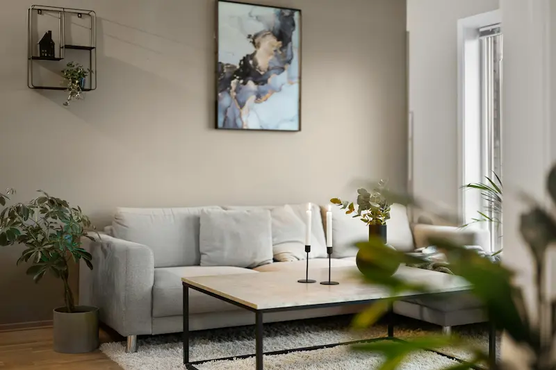
For a single piece:
- Aim for 60–75% of the sofa’s width.
- Example: For a 210 cm sofa, your art width should be roughly 125–160 cm.
- Hang it so the center is around 57–60 inches (145–152 cm) from the floor.
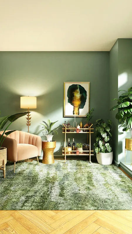
If your living room leans warm and relaxed, I like a piece of modern rustic wall art here: think abstract brushstrokes in clay, sand, and charcoal tones, or a soft landscape with muted greens and taupes. It’s calm, neutral, and works with almost any style.
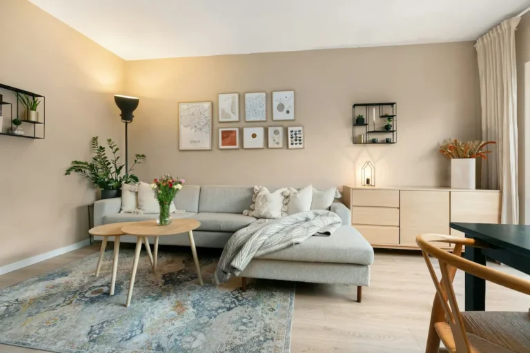
For a grid gallery above the sofa:
- Use identical frames and mats for a clean, modern look.
- Keep 2–3 cm between frames to read as one big visual block rather than lots of tiny pieces.
- As a rule, the entire gallery should still follow the 2/3 width rule of the sofa.
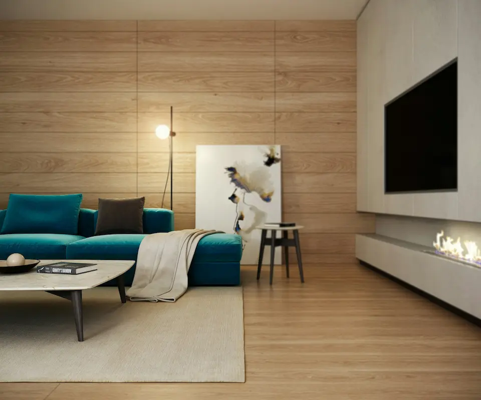
The TV Wall
The TV wall is where most people give up and do nothing, then wonder why the room feels visually heavy on one side.
You have three main strategies:
- Camouflage
- Paint the wall behind the TV a slightly darker color than the rest of the room (for example, if your walls are a soft beige, use a deeper taupe on the TV wall).
- The screen blends in more, especially at night.
- Flanking Decor
- Add two vertical elements on either side of the TV:
- Slim picture lights
- Sconces
- Narrow framed art or a pair of small shelves
- This balances the black rectangle so it doesn’t feel like the only thing on the wall.
- Add two vertical elements on either side of the TV:
- Low, Long Storage
- A low media console that extends beyond the width of the TV helps anchor the wall.
- Style it with low, simple decor: a stack of books on one side, a plant on the other.
- In my experience, less is more here—don’t crowd the surface with lots of tiny objects.
The “Dead” Corner
Every living room has that awkward corner that feels like wasted space.
Instead of forcing a random chair there, think vertical:
Options that work well:
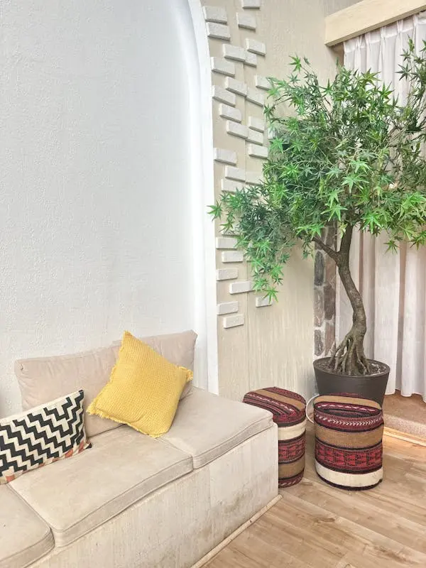
- A tall plant (real or high-quality faux) in a simple pot
- A corner shelf unit with 3–5 shelves, styled lightly
- A floor mirror angled toward a window to bounce light
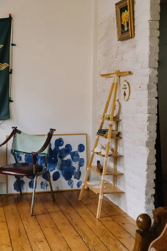
If your space is tighter, I like using a slim ladder shelf with:
- One shelf for books
- One for a small storage basket
- One for a plant or sculptural vase
The goal is to give the corner height and purpose, without visually blocking the room.
The Large Empty Wall
This is where large wall decor ideas for living room truly matter. One tiny frame floating in the middle of a huge wall will always look wrong, no matter how beautiful the art is.
You have a few great routes:
- Oversized Canvas
- One large piece that fills most of the visual field.
- This works especially well in minimalist or modern spaces.
- Molding or Wainscoting
- Add simple box molding painted the same color as the wall.
- Inside each “box,” you can leave it empty (purely architectural) or hang smaller pieces centered within.
- Floor-Leaning Mirror
- Ideal in smaller rooms or darker spaces.
- Make sure it’s at least three-quarters the height of the wall so it looks intentional, not like an afterthought.
When in doubt with a big wall, go bigger or more structured, not smaller and random.
The 5 Golden Rules of Hanging Art (The Data Hook)
You don’t need “an eye” for design if you have a few reliable measurements. These are the rules I come back to over and over.
Rule 1: Eye Level (57–60 inches)
- The center of your artwork should usually sit between 145–152 cm (57–60 inches) from the floor.
- This is considered average eye level in galleries and works surprisingly well at home.
The only time I break this rule is in rooms with very low seating or when I’m intentionally creating a dramatic, low-slung gallery.
Rule 2: Furniture Gap (6–8 inches)
When hanging art above a sofa, console, or headboard:
- Keep a 6–8 inch (15–20 cm) gap between the top of the furniture and the bottom of the frame.
Too high and the art looks like it’s floating away. Too low and it feels cramped.
Rule 3: Spacing Between Frames (2–3 inches)
For gallery walls:
- Maintain 2–3 inches (5–7 cm) of space between each frame.
This distance is tight enough for the eye to read the layout as one grouping, but wide enough that the pieces can breathe.
Rule 4: Scale (60–75% of Wall Space)
As a general guide, wall decor should cover:
- 60–75% of the available wall width (the part not blocked by furniture or architectural elements).
If you’re decorating above a long console, measure the console’s width and size your art or gallery to around two-thirds of that.
Rule 5: Balance the Visual Weight
You don’t want all the “heaviness” on one side of the room.
- Spread darker, larger pieces around the space, not all on one wall.
- If you have a big, dark TV on one side, try a substantial piece of art or a large mirror on the opposite wall to counterbalance it.
If you ever stand in your living room and feel like one side looks “busy” and the other looks “empty,” you’re probably breaking this rule.
Trending Wall Decor Styles for 2026
Trends come and go, but some directions have been building for a few years and feel genuinely livable.
Textural Art
Flat posters are fine, but texture is what makes walls feel rich and layered.
Think about:
- Plaster or relief art in soft neutrals
- Woven pieces like subtle macramé or arranged baskets
- Fabric art, such as a linen panel or simple quilted piece in a modern pattern
For a modern rustic twist, I like large, textured canvases in off-whites, warm greys, and clay tones. They read as modern rustic wall art without being busy.
Functional Decor
Shelves and storage can double as decor if you style them intentionally.
Ideas:
- Floating shelves with a mix of books, plants, and one or two sculptural objects
- A picture ledge layered with framed art, leaning instead of hanging
- Slim wall hooks or peg rails near the entry zone for bags and hats, styled neatly
In my experience, functional decor works best when you keep a 60/40 ratio: about 60% functional pieces (books, storage) and 40% purely decorative items.
Oversized Minimalism
Instead of 10 small prints scattered everywhere, choose:
- One oversized canvas, photograph, or wall-hanging
This is wonderful for small spaces because it feels bold but not cluttered. It also ties in perfectly with modern and minimalist interiors where you want impact with as few pieces as possible.
Sconces as Sculpture
Wall lighting doesn’t have to be purely practical.
Look for:
- Clean, architectural lines
- Interesting shades (linen, glass, or metal in simple shapes)
- Plug-in options if you’re renting
Mounted on either side of a large piece or above a console, sconces act almost like jewelry for your walls.
Gallery Wall 101: Layouts That Work
Gallery walls are everywhere, but very few are planned properly. A little structure goes a long way.
The Grid (Formal / Modern)
Best for:
- Modern, minimal, or transitional spaces
- Black-and-white photography, prints, or simple line drawings
Key tips:
- Use identical frames and mats.
- Align frames to form a perfect rectangle or square.
- Stick to that 2–3 inch spacing between each piece.
This layout is especially good if your room already has a lot of curves or organic shapes and you want something clean and structured on the wall.
The Organic Cloud (Eclectic / Boho)
Best for:
- Collected art, travel prints, children’s drawings, personal photography
How to build it:
- Start with one anchor piece slightly off-center (not in the exact middle of the wall).
- Build around it with smaller frames, keeping the overall shape roughly oval or cloud-like.
- Maintain consistent spacing, even if the frame sizes differ.
I prefer to keep one element consistent—either all frames in the same color or all mats in white or off-white—so it still looks curated, not chaotic.
The Ledge (Flexible / Changeable)
Ideal if:
- You like to swap art seasonally
- You’re renting and want fewer holes in the wall
Use:
- One or two long picture ledges stacked vertically
- Layer frames, books, and small objects along them
Because everything leans rather than hangs, you can edit and restyle constantly without patching a single nail hole.
Renter-Friendly Wall Decor (No Nails)
If you can’t drill or you just don’t want the hassle, you still have plenty of options.
Renter-friendly strategies:
- Command Strips & Hooks
- Perfect for light to medium-weight frames and small mirrors.
- Always follow the weight guidelines and clean the wall before sticking.
- Leaning Art
- Large frames or canvases leaning on top of a console, media unit, or even on the floor against the wall.
- Layer smaller pieces in front for a styled look.
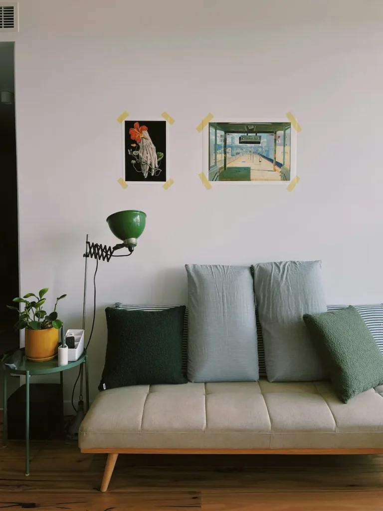
- Washi Tape Grids
- Use neutral-colored washi tape to “frame” postcards, photos, or prints directly on the wall.
- It’s playful, temporary, and leaves almost no residue.
- Removable Wall Murals or Panels
- Great behind a sofa or on the TV wall.
- Choose subtle patterns or textures so the room stays calm and modern.
In my experience, if you’re renting, it’s worth investing in high-quality adhesive systems rather than the cheapest hooks. Better adhesives mean fewer surprises when you eventually move out.
FAQ: Living Room Wall Decor Ideas, Layouts, Rules & Trends
How high should I hang pictures in the living room?
Aim to keep the center of the artwork at 57–60 inches (145–152 cm) from the floor.
This usually lands at comfortable eye level for most adults and keeps art from creeping too high up the wall.
If you have very tall ceilings, resist the temptation to chase the height—keep art anchored to where people actually live and sit.
What can I put on a wall instead of pictures?
You’re not limited to framed art.
Consider:
- Textural pieces like woven wall hangings or fabric panels
- Floating shelves with curated objects and books
- A large, simple wall mirror
- Architectural details like molding, slatted wood panels, or painted “blocks” of color
The key is to treat the wall as a designed surface, not just a place to hang prints.
How do I decorate a large wall cheaply?
For budget-friendly large wall decor ideas for living room, think scale over quantity.
Some ideas:
- Paint a large color-block shape (arch, rectangle, or stripe) and hang a simple print inside it
- Create a DIY gallery with thrifted frames painted the same color and filled with printable art
- Use a single floor-leaning mirror or simple fabric panel as a focal point
If you focus on proportion and placement, your walls will look intentional and stylish, regardless of how much you spent.
If you apply even a few of these rules and layouts, your living room walls will stop feeling like a problem to solve and start feeling like part of the design. And once the walls are right, the whole room suddenly feels more finished, more cohesive, and a lot more “you.”