Green Living Room Ideas: How To Get It Right Without Turning Your Space Into a Jungle
You know that feeling when you save a hundred “sage green living room” photos and somehow your own space still looks flat, dull, or just… off? Green is one of the most forgiving colors in design, but it’s also one of the easiest to mess up with the wrong undertone or lighting.
Let’s walk through how to use green in a living room in a way that feels calm, modern, and expensive, without slipping into dark, swampy or childish territory. I’ll flag where to go soft (sage, pistachio) and where to go bold (emerald green accent wall, deep “forest” palettes), and I’ll call out the exact lighting mistakes that quietly ruin good paint.
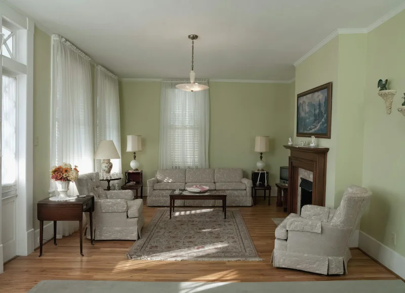
Why Green is the New Neutral in 2026
Green is no longer treated as a “feature color.” In 2026, it’s behaving more like a neutral base: quiet enough to live with every day, but rich enough to feel designed.
H3: The Biophilic Effect
Biophilic design is simply the practice of bringing cues from nature indoors to support wellbeing: natural light, plants, wood, stone, and yes, natural colors like green. Studies on views of greenery and exposure to natural settings show reduced stress and lower heart rates compared with built-only environments, which is why hospitals, schools, and offices are leaning into green tones instead of pure grey.
You do not need a rainforest in your living room to get the benefit. Even a sage green wall, a leafy rug pattern, and three well-chosen plants can give your brain enough “nature signals” to feel calmer.
H3: Warm vs. Cool Greens
Think of greens as sitting on two main branches:
- Yellow-based greens (olive, moss, chartreuse):
- Feel warm, cozy, and slightly nostalgic.
- Work beautifully in traditional, cottage, or vintage-leaning rooms.
- Pair well with warm woods, terracotta, camel leather, and brass.
- Ideal if you want the room to feel snug and lived-in.
- Blue-based greens (teal, sage with a blue lean, deep forest):
- Feel cooler, more architectural, and slightly more modern.
- Visually recede a little, which can make walls feel further away and the room subtly larger.
- Pair well with black, stone, light oak, and soft greys.
- Great for “quiet luxury” and cleaner lines.
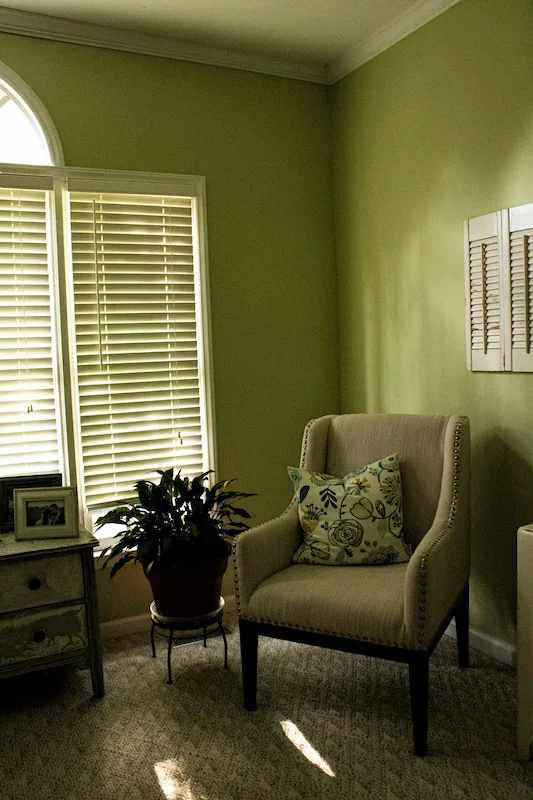
If you’re nervous, sage green is the safest starting point. It’s soft, adaptable, and works with both warm and cool accents as you figure out your style.
The Trending Greens of 2026
Here’s the spectrum of greens dominating living room moodboards right now, from soft to dramatic.
- “Pistachio” & “Matcha”
- Soft, milky greens with a touch of grey.
- Perfect for renters who want color that still feels light and airy.
- I like these for all-over wall color in smaller living rooms because they brighten the space while adding personality.
- “Dead Salmon” Greens (muddy brown-greens)
- Inspired by historic English interiors: a bit dirty, a bit brown, very sophisticated.
- Work beautifully with antique pieces, linen slipcovers, and checkerboard rugs.
- These are ideal if you want your green living room to feel like a quietly aged library, not a brand-new showroom.
- “Digital Lime”
- A sharp, almost neon accent green.
- This is not a wall color; it’s an accent: a single chair, a side table, a cushion.
- Use it to cut through a very neutral space and keep it from feeling sleepy.
- “Black Forest”
- Extremely deep greens that almost read black at night.
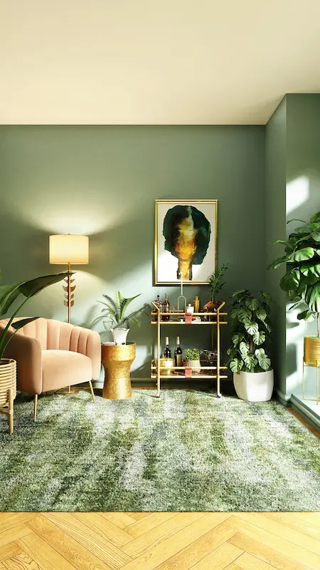
- Brilliant for an emerald green accent wall behind a TV, fireplace, or shelving.
- These shades work best in rooms with at least some decent lighting (natural or artificial), otherwise you risk a cave.
You don’t need all four in one room. Choose one “dominant green family” and then layer neutrals and textures around it.
Perfect Pairings: What to Mix with Green
To stop scrolling and move into action, it helps to see pairings laid out clearly. Here’s a simple cheat table you can use when planning your scheme.
| Green Shade | Best Pairing | The Vibe |
|---|---|---|
| Sage | Terracotta | Earthy / Desert |
| Emerald | Brass / Gold | Luxe / Glam |
| Olive | Mustard Yellow | Retro / 70s |
| Mint | Lavender | Playful / Pastel |
Use this as a starting framework, not a rigid rule. For example, a sage green living room with terracotta cushions and a sandstone vase will naturally lean warm and grounded. Swap terracotta for charcoal and chrome, and suddenly the same green feels cooler and more contemporary.
How to Add Green (Without Painting the Walls)
If painting an entire living room feels overwhelming, build your green palette in layers instead of starting with the most permanent change.
- The “Wrapped” Furniture Trick
- Instead of buying a new TV console or sideboard, you can wrap the existing piece with architectural film or adhesive vinyl in a muted green.
- This works well on simple, flat-fronted furniture and is renter-friendly if you choose removable products.
- It’s a smart way to test a bold sage or deep emerald before committing to an accent wall.
- The “Living” Wall
- A living wall can be anything from a slim vertical planter with trailing plants to a more engineered moss wall panel.
- The goal is to create one strong biophilic moment rather than scattering plants everywhere.
- In my experience, one tall plant with presence (like a ficus or olive tree) plus a small cluster on a console looks more intentional than ten tiny pots spread out.
- Color Drenching (Green Edition)
- If you’re ready to paint, color drenching in green is powerful: walls, skirting, doors, and sometimes even the ceiling in the same or slightly varied green.
- This blurs edges and makes the room feel like a single, calm envelope rather than a box with lots of lines cutting it up.
- I prefer to use mid-to-deep greens for drenching; very pale greens can look washed out if everything is the same tone.
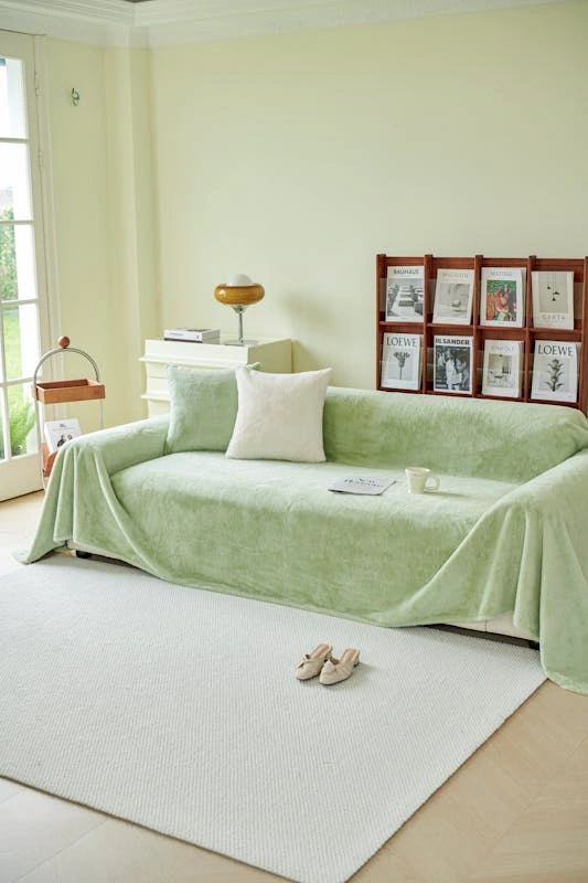
- The “Velvet Anchor”
- A single green velvet sofa or armchair can carry the color story without any painted walls at all.
- Velvet deepens color and catches the light in a way that makes the room feel richer instantly.
- If you go this route, keep the rug and walls fairly neutral and let the sofa be the main character.
The Kelvin Rule for Green Paint
Lighting is where a good green living room lives or dies. The same sage paint can look fresh in the showroom and murky at home because the bulb temperature is wrong.
- Green and Color Temperature
- Green reacts strongly to warm and cool light.
- For most green living rooms, aiming the overall lighting in the 3000K–3500K range is a good middle ground: warm enough to feel inviting, cool enough to keep greens from going muddy.
- This applies especially to overheads and main floor lamps.
- What to Avoid (Sage & Olive)
- Very warm bulbs around 2700K can push subtle sage into a yellow-brown territory that looks dirty instead of soft.
- Very cool bulbs around 5000K can make olive and warmer greens look sickly or sterile, especially at night.
- Practical Strategy
- Use warmer bulbs (around 2700K–3000K) in table lamps for cozy corners, and slightly cooler ones (up to 3500K) in ceiling fixtures so the overall cast stays balanced.
- If you’re using an emerald green accent wall, add wall washers or sconces aimed along the surface, not straight at it. This brings out depth and texture instead of leaving a black hole in the evening.
If you’re not sure, buy one smart bulb, experiment across the Kelvin range in the evening, and then commit to a color temperature once you’ve seen how your specific green behaves.
If you’d like, next we can build a couple of complete moodboards around specific looks, for example: “sage green + terracotta + light oak” or “emerald + brass + black forest accent wall,” so you have plug-and-play shopping lists instead of just concepts.