The “Blue Theory” Living Room Guide (2026 Edition)
Blue is the color everyone saves to their Pinterest boards and then quietly avoids on the paint swatch wall. Used badly, it can feel cold, flat, or like a waiting room. Used well, it’s one of the most versatile, calming, and luxurious tools you have.
In this guide to Blue Living Room Ideas, I’ll walk you through how to choose warm vs cool blues, the hottest blue paint directions for 2026, how to combine blue with other colors, and how to stop your room from feeling like an aquarium.
The Temperature Test – Warm Blue vs Cool Blue
Blue is incredibly sensitive to light direction. Before you fall in love with a swatch, you have to read your room.
The North-facing rule
North-facing rooms already lean cool because the natural light has a blue-grey cast. If you add a grey-based blue on top, you double down on the chill and the room feels flat and dull.
In those rooms, I strongly prefer green-based blues: teal, aqua, blue-green, or “sea glass” tones. The yellow/green undertone offsets the cool daylight and keeps skin tones looking alive instead of washed out.
If you insist on a deeper tone in a north room, choose a muted teal or petrol blue rather than a steel navy. They still read as blue, but with more depth and warmth.
The South-facing freedom
South-facing rooms get warm, golden light for most of the day. That means you can safely use crisp, cool “Greek island” blues and they’ll still feel inviting, not icy.
This is where navy, ink blue, and grey-blue really shine. The warm daylight balances their coolness, so you get that clean, modern look without the sadness.
In west-facing rooms, remember the light goes golden in the afternoon, so cool blues can look especially beautiful at sunset.
The undertone cheat sheet
Here’s a simple way to think about undertones when you’re shortlisting paints and fabrics:
| Undertone | Looks Like | Best For |
|---|---|---|
| Green-Blue | Teal, aqua, blue-green | North rooms, cozy spaces |
| Purple-Blue | Indigo, periwinkle | Dramatic, moody evening rooms |
| Gray-Blue | Slate, steel | South rooms, modern minimal |
Always test at least three undertones on the actual wall and look at them morning, afternoon, and evening before committing. Blue shifts dramatically across the day.
Blue Trends Defining 2026
Let’s talk about where the hottest blue paint colors for 2026 are heading, without getting hung up on specific brand names.
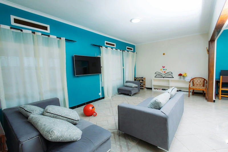
1. Electric cobalt – the anti-minimalist accent
Cobalt and “electric” royal blues are back as statement accents. You’ll see them on a single wall, a media console, or even a pair of lounge chairs, especially in creative or younger homes.
I don’t recommend drenching a tiny living room in cobalt, but I love it for a feature piece against warm neutrals or wood.
2. Mineral blue – the new gray
Ultra-pale, chalky mineral blues are increasingly used where we used to default to greige or light gray. They read as neutral but add a whisper of color that flat grays lack.
If you want color without committing to a “blue room,” a mineral blue on the walls with neutral furniture is a very safe direction.
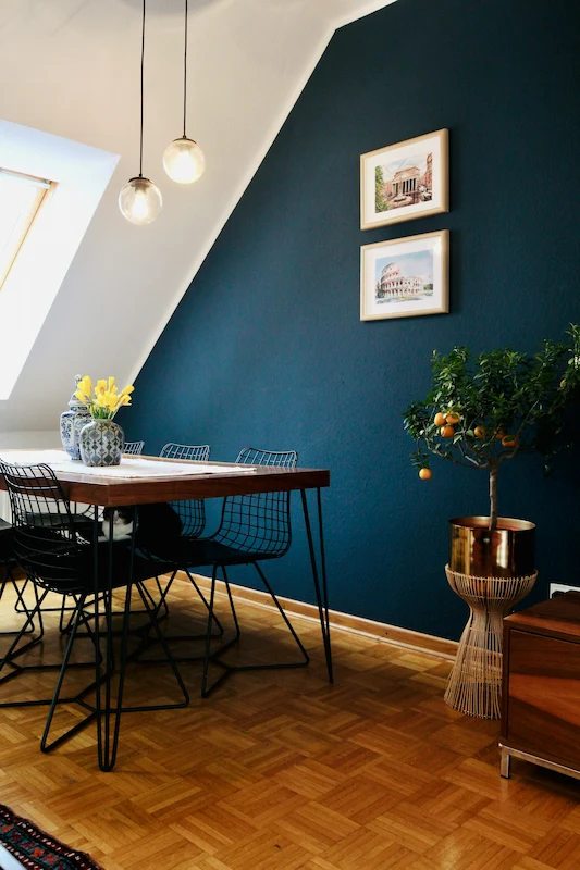
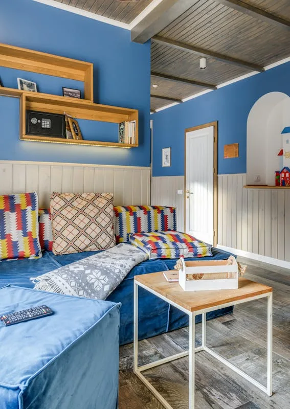
3. Drenched navy rooms
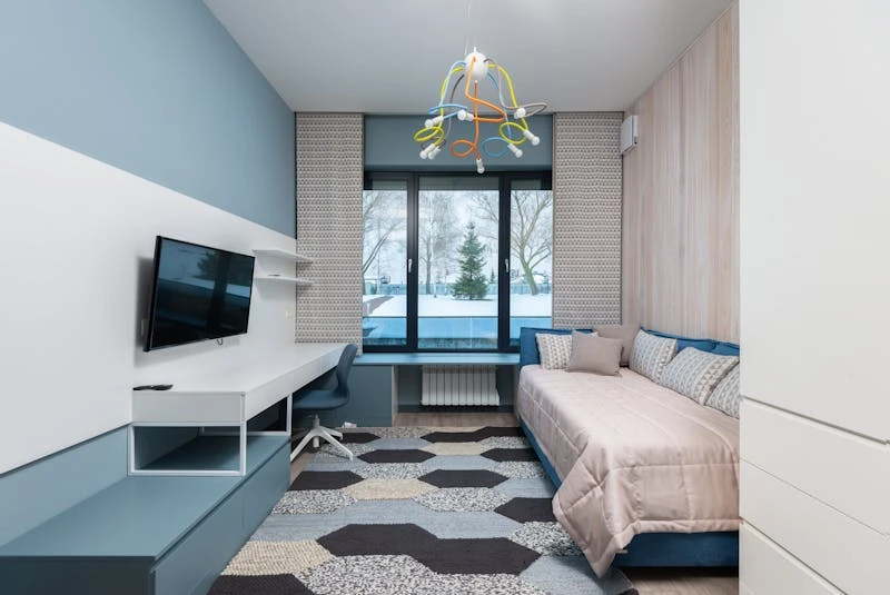
Blue color drenching is now mainstream: painting walls, trim, and sometimes the ceiling in the same deep navy for a cocooning, cinema-like effect.
In my experience, this works best in medium or small rooms that you mostly use in the evening, especially TV-heavy spaces or snug sitting rooms.
4. Blue and brown – the 70s revival done right
Powder blue paired with chocolate brown, caramel leather, or walnut wood is everywhere again.
The trick is to keep the blue slightly muted and the browns rich and warm so it feels sophisticated, not cartoonish.
The Color Algebra – What to Mix with Blue
Once you’ve chosen your shade, pairings make or break the palette. Here are combinations I use a lot for blue living rooms:
Blue + burnt orange
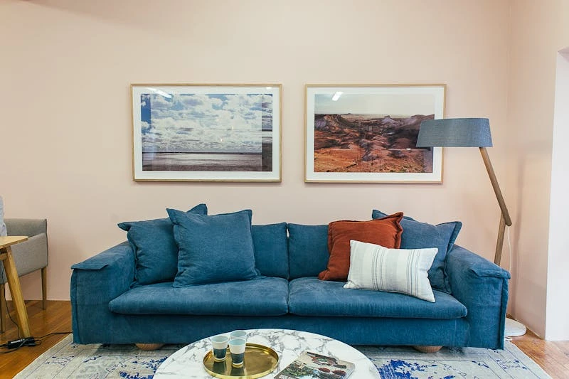
This is a classic complementary pairing. A navy or mineral blue wall with rust or burnt orange cushions instantly feels energetic and modern.
I like to repeat the orange only two or three times in the room (a throw, a small ottoman, maybe an art detail) so it doesn’t overpower the blue.
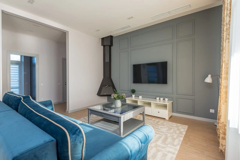
Blue + brass
Blue and brass is the timeless “nautical luxe” combo. Brass curtain rods, side tables, or lamp bases glow against dark and mid blues.
If you already have chrome everywhere, you can still bring in brass in small, grouped accents so it looks intentional rather than mismatched.
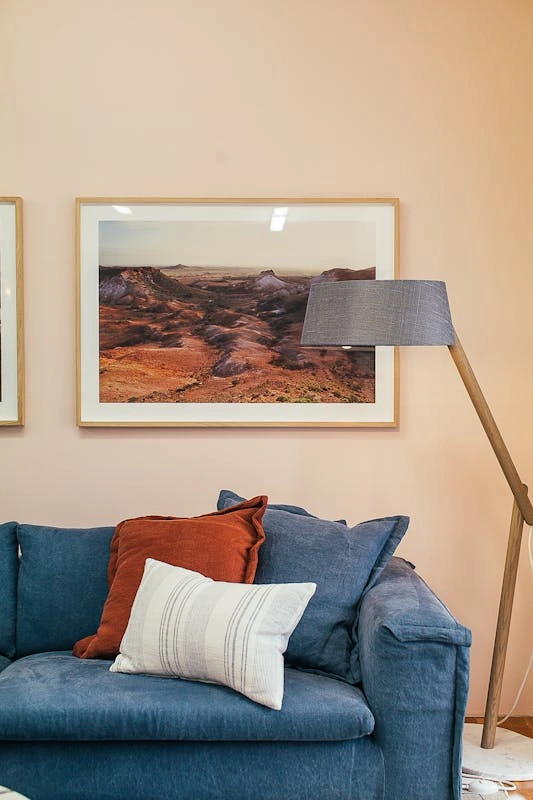
Blue + pale pink
Soft pink with blue is fantastic if you want a calming, spa-like living room. Think dusty blue walls, oatmeal sofa, and a blush pillow or ottoman.
I recommend keeping the pinks muted and slightly dirty (less bubblegum, more rose clay) to avoid a nursery feel.
Blue + black
This is the sharp, editorial route. Deep blue walls with black frames, black metal shelving, or a black floor lamp feel chic and slightly masculine.
Use plenty of texture (bouclé, linen, wood) so the combination feels layered rather than harsh.
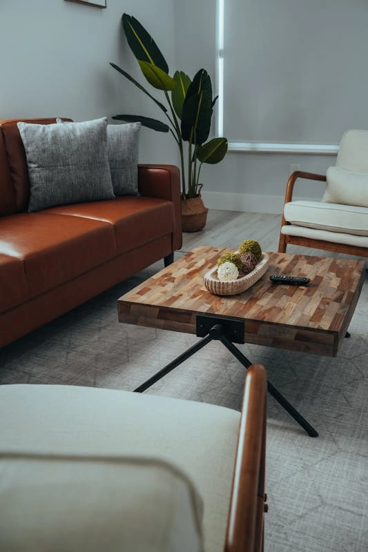
Anchoring the Room – Furniture and Textiles
Blue is powerful; your furniture has to work with it, not fight it.
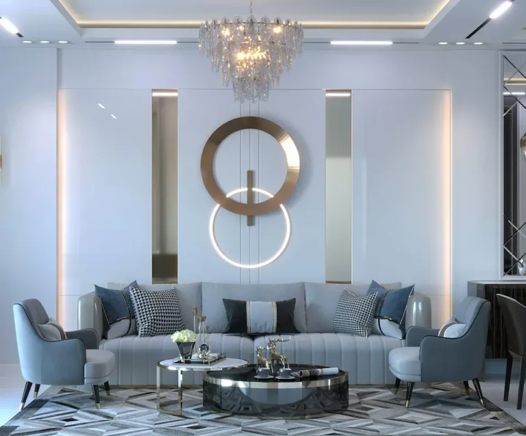
The blue sofa dilemma
If the sofa is blue, you’ve already made it the star. In that case, I usually recommend:
- Walls: soft white, pale stone, or a very light blue from the same family
- Accents: warm woods, brass, and textured neutrals
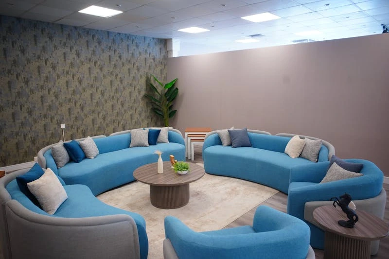
Going blue-on-blue (sofa and walls) can be beautiful, but you need enough contrast in lightness so the sofa doesn’t disappear. Think medium blue sofa against very pale mineral blue walls or deep navy walls behind a lighter denim-blue sofa.
Rug selection with blue walls
With blue walls, the safest rug options are:
- Jute, sisal, or wool in warm neutrals – they add texture and warmth without adding another strong color.
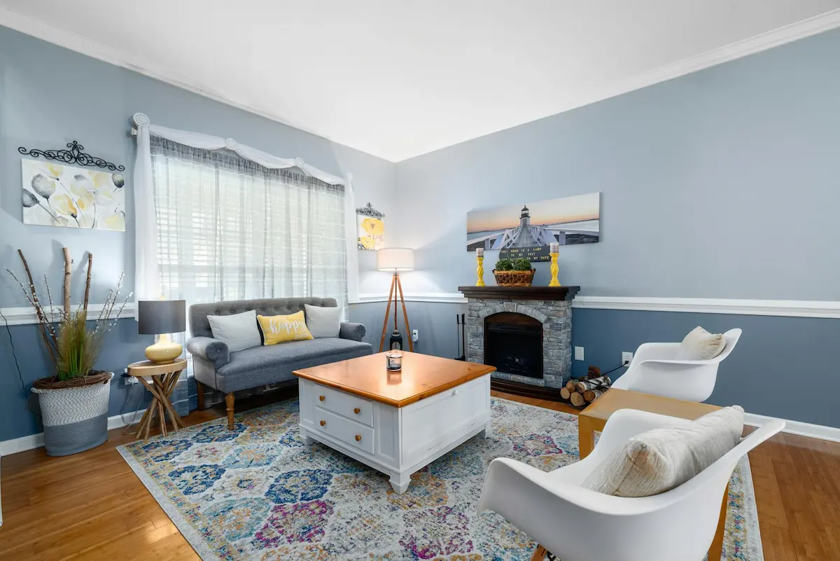
- Vintage red or rust rugs – the blue and red contrast feels collected and intentional, especially in more traditional or eclectic rooms.
Avoid busy, multicolor rugs that introduce a totally different blue; that’s when the room starts looking noisy.
Troubleshooting – “My Blue Room Feels Like an Aquarium”
If your blue living room feels cold or flat, don’t panic. You usually fix it with three levers: wood, warmth, and light.
Add warm wood tones
Blue loves warm wood. Walnut, teak, or even mid-tone oak instantly soften a blue-heavy space.
In practice, this means introducing a wooden coffee table, sideboard, or side chairs rather than more black or chrome.
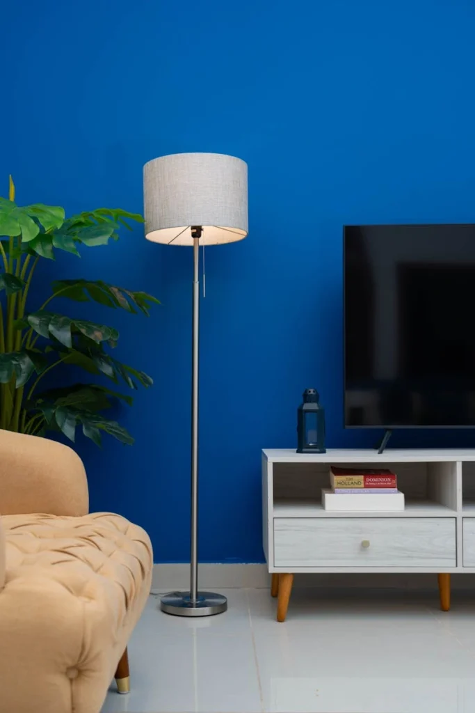
Check your lighting temperature
Cool bulbs will make any blue feel icier. For living rooms, I almost never go above 2700K (warm white).
Swap any 4000–5000K bulbs for 2700K versions, especially in table and floor lamps. The difference to both your paint and your skin tone is huge.
Soften the edges with textiles
If everything in the room is smooth and hard – leather sofa, tiled floor, metal tables – the blue will feel harder too.
Add at least one high-pile or wool rug, some textured cushions (bouclé, linen, or chunky knits), and full-length curtains to break up the hard surfaces.
If you treat blue like a science experiment – checking light direction, undertones, pairings, and lighting – it stops being scary and starts working for you. Pick your temperature, choose one of the 2026 trend directions that actually fits your lifestyle, and then balance it with warm materials and lighting.
That’s how you get a blue living room that feels intentional, calm, and genuinely livable, not just good in photos.