Grey Scandinavian Bathroom Color Palette: How To Get Warm, Calm And Not-Cold
Grey Scandinavian bathroom color palettes can look incredibly expensive and spa-like, or they can feel like a cold parking garage. The difference is not luck. It is undertones, texture, and what you pair the grey with.
If you have ever painted your bathroom a “stylish” cool grey and then wondered why it suddenly felt like a prison cell, you are exactly who I am writing this for.
We will talk about warm grey vs cool grey bathroom paint in real, practical terms, how to use concrete-effect bathroom tiles in a Scandi way, and how to layer wood and metal so your space feels like a calm Nordic spa, not a basement.
The Palette – Choosing Your “Temperature”
Before you buy a single can of paint, decide if you want your bathroom to feel crisp, cozy, or dramatic. That choice controls everything: tile, wood, metal, and light.
In my experience, the biggest mistake with grey Scandinavian bathrooms is ignoring the room’s natural light and just copying a Pinterest photo. Do not do that. Start with temperature.
Cool Grey (The “Crisp” Look)
Cool grey has blue or green undertones. It feels clean, architectural, and slightly sharp.
I only recommend cool grey bathroom paint in south-facing rooms or spaces with strong daylight. The natural warm light balances the coolness and keeps it from feeling icy.
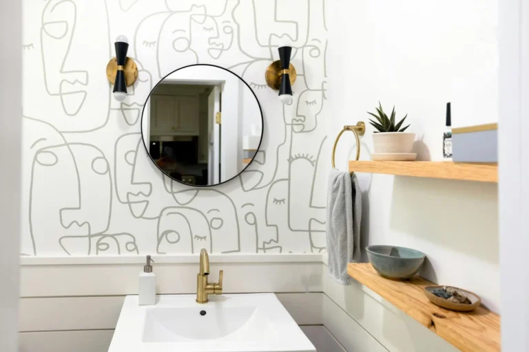
You can look for shades similar to Stonington Gray or greyer whites like Decorator’s White (which has a subtle grey undertone), especially if you want that crisp, gallery-like backdrop for black fixtures and white sanitaryware.
Pair cool grey with:
- White sanitaryware (to make everything feel fresh and precise)
- Matte black taps and shower frames for contrast
- Light oak or ash so the room does not slide into “office bathroom” energy
If your room is small, keep cool greys on the lighter side and avoid covering every surface in the darkest tone. Use them mostly on walls and keep floors a touch warmer.
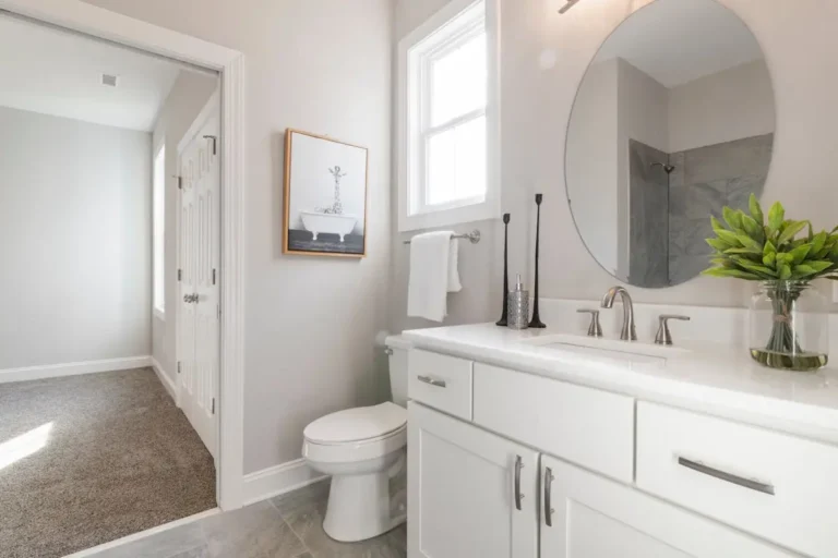
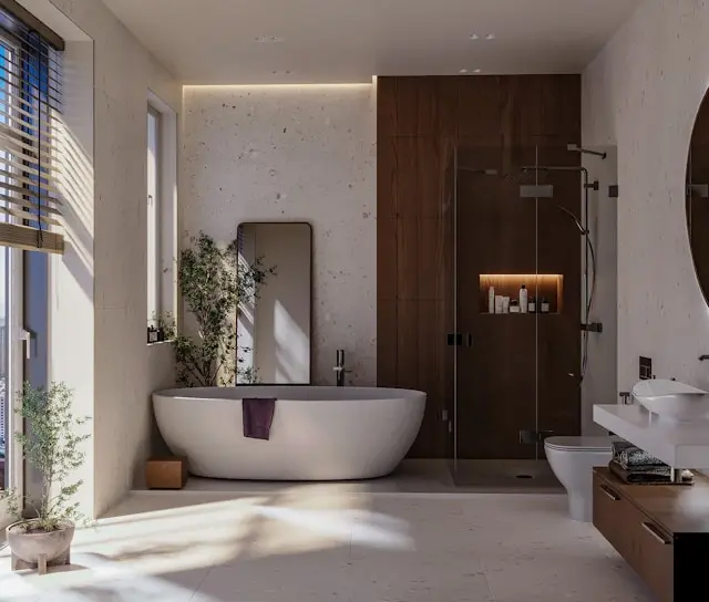
Warm Grey / Greige (The “Cozy” Look)
For windowless or north-facing bathrooms, warm grey is non-negotiable. This is where “greige” comes in: that magical mix of grey and beige that feels soft rather than icy.
Shades in the family of Revere Pewter or Agreeable Gray are good references. They sit between stone and putty, and they love warm light and wood.
Why I prefer warm grey in most Scandinavian bathrooms:
- It works beautifully with white oak vanities and rattan accessories.
- It is forgiving with different light temperatures; it doesn’t swing as wildly blue or green.
- It naturally leans into the Hygge vibe that Scandinavian design is known for.
Use warm grey on:
- Main wall surfaces
- Larger-format wall tiles
- Built-in storage units painted to match the walls for a seamless, minimal look
If your sanitaryware (toilet, basin) is a very cool, almost blue-toned white, warm greige will soften the contrast instead of amplifying it.
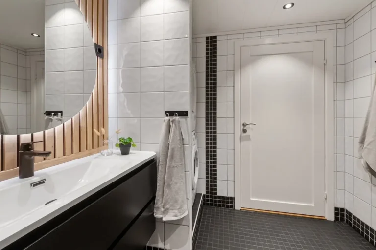
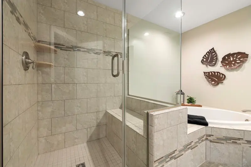
Dark Anthracite (The “Mood” Look)
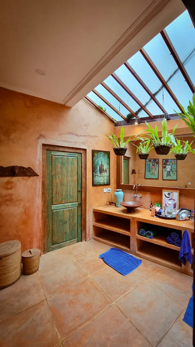
Dark anthracite greys are incredible in bathrooms when used with restraint. Think soft charcoal, not pure black.
I like anthracite for:
- Floors, to ground the space
- Feature shower walls, especially in concrete-effect bathroom tiles in Scandi style
- Window frames or shower screens to sharpen the architecture
The key is balance. If you go dark on the floor and one wall, keep the ceiling and the remaining walls lighter so the room still feels open.
A simple formula that works well:
- Anthracite floor tile
- Medium greige or light taupe-grey walls
- White ceiling
- Warm oak vanity
You get drama without losing the “calm” that defines Scandinavian bathrooms.
Texture Over Paint – The Scandi Way
Scandinavian design has never really been about wild color. It is about surface and light. In a grey palette, texture becomes your secret weapon.
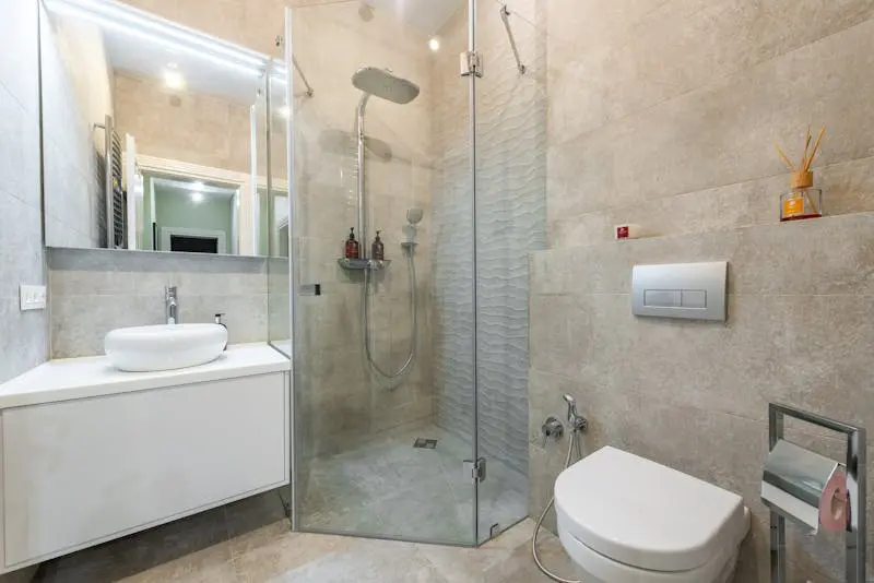
Concrete & Microcement
If you want that high-end, spa-like Scandinavian bathroom, this is where you start.
Microcement (or other concrete-effect finishes) wraps floors and walls in a single, seamless skin. You eliminate grout lines, which instantly makes the room feel bigger and calmer.
I recommend concrete-effect surfaces when:
- Your bathroom is small and you want as few visual breaks as possible.
- You like minimalism but still want the room to feel soft and tactile.
- You want a “wet room” look without the visual fuss of lots of small tiles.
Choose tones that sit in the warm grey family – think cloud, stone, putty, not raw steel. If your microcement is too blue, it will fight your wood accents and any warm lighting.
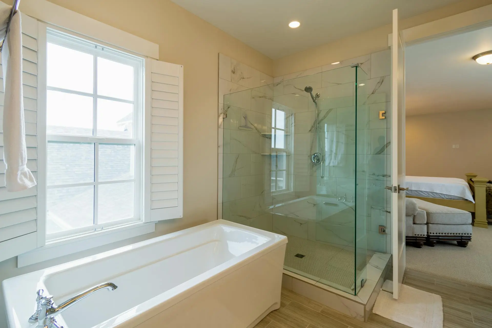
Slate & Stone
Natural stone is the “quiet luxury” version of grey.
Slate, limestone, or softly honed stone tiles give you something concrete-effect cannot: natural variation. Each tile has slight tone shifts and veins, which adds depth and prevents your bathroom from feeling flat.
Tips if you go this route:
- Use stone on the floor and shower walls, and keep the upper walls painted in a coordinating greige.
- Avoid high-contrast grout lines. Choose a grout that nearly matches the stone.
- Pair stone with simple white sanitaryware so the space doesn’t feel heavy.
Terrazzo
Terrazzo with a grey base and white chips is a great way to add personality while staying minimalist.
I like it:
- On the floor only, with plain grey or white walls.
- Or as a vanity countertop, paired with solid-color tiles elsewhere.
Keep the chip colors subtle (white, off-white, maybe a touch of warm stone) so it stays in the Scandinavian world, not heading into busy, maximalist territory.
The 60–30–10 Rule for Grey Scandi
If you are unsure how to combine materials, treat your grey Scandinavian bathroom color palette like a recipe.
60% Primary: Light Grey / Greige
This is your base.
Let light grey or greige cover the majority of the surfaces:
- Wall paint or main large-format wall tiles
- Built-in storage painted to match the walls
- Possibly the ceiling if you want a cocoon effect
The goal is a soft, continuous envelope that feels calm and cohesive.
30% Secondary: Warm Wood
This is where the Hygge factor comes in.
In my experience, if you remove wood from a grey bathroom, you remove its soul. Aim for roughly 30% of the visual story to be:
- White oak, ash, or light beech vanities
- Wood-framed mirrors
- Open shelves in oak or birch
- Small accessories like wooden stools or towel hooks
This proportion doesn’t have to be mathematically perfect, but you should clearly see a warm, natural counterpoint to all that grey.
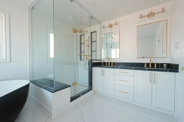
10% Accent: Matte Black or Brass
Finally, add around 10% of a strong accent metal to sharpen the look.
Good options:
- Matte black taps, shower frame, hooks, and towel rails for a more architectural, monochrome Scandi vibe.
- Brushed brass or brushed gold fixtures if you prefer a softer, more spa-like warmth.
What I do not recommend is mixing too many metals in a small bathroom. Pick one main metal and, at most, a second in a very small amount.
Without this 10% accent, grey and wood can blend into something a little too soft and flat. The metal is the “eyeliner” that defines the features.
2026 Trend Watch – “Tone-on-Tone” Grey
The big move for grey Scandinavian bathrooms in 2026 is tone-on-tone, not high contrast.
Instead of white walls and dark grey floors, designers are now layering three related greys for a richer, more cocooning feel.
How to Build a Tone-on-Tone Grey Scheme
Use a simple light–medium–dark stack:
- Dark grey on the floor (or the shower back wall)
- Medium grey for the vanity or lower wall tiles
- Light grey / greige for the upper walls and ceiling
This gradation keeps the room from feeling top-heavy and makes it visually grounded.
You can also play with sheen:
- Matte or satin on walls
- Slightly more sheen on tiles
- Soft sheen on concrete-effect floors
The goal is subtle shifts, not obvious blocks of color.
Where Wood Fits Into Tone-on-Tone
Even in a three-grey palette, you still need wood.
In a tone-on-tone scheme:
- Keep the wood relatively light (oak or ash) so it doesn’t fight the greys.
- Let the vanity, a small bench, or a framed mirror be your main wood elements.
- Avoid orange or red woods like cherry or mahogany. They clash with calm grey and kill the Scandi mood.
Think of wood as your “warm filter” over the entire scheme.
FAQ – Grey Scandinavian Bathroom Color Palette
What color wood goes with grey bathrooms?
I recommend light oak or ash with grey bathrooms, especially if you want a true Scandinavian feel. These woods have soft, neutral undertones that warm up grey without turning it yellow or orange.
Avoid strong red-toned woods such as cherry or some mahogany stains. They can make greys look dirty or clash with cooler undertones.
Does grey make a small bathroom look smaller?
Dark, flat grey everywhere can make a small bathroom feel smaller, especially if the lighting is cool and harsh.
However, a light “cloud grey” or greige actually blurs the corners of the room and can make it feel larger and more spa-like. If you want to use darker grey, keep it on the floor or one feature wall and balance it with lighter walls and plenty of warm light.
What metal finish goes with grey?
- Chrome tends to disappear into cool grey, which can be nice if you want a very calm, minimal space.
- Matte black pops beautifully against both light and dark greys and gives a modern, architectural edge.
- Brushed brass or brushed gold is my go-to when a grey palette feels too cold. It instantly adds warmth and elegance without breaking the Scandinavian simplicity.
If your grey bathroom currently feels icy or flat, you almost always fix it faster with wood and metal changes than with repainting everything. Start there, and the whole color palette will suddenly make sense.