Bathroom Tile Ideas: Trends, Layouts & Shapes (2026)
Tile is the skin of your bathroom.
It covers most of what your eye sees, which means bad tile = bad room, no matter how nice your vanity is.
So when you’re planning bathroom tile ideas: trends, layouts & shapes (2026), don’t just scroll for a pretty color. You need to decide three things together: texture, layout, and grout. Get that trio right and even a small, basic bathroom can look like a boutique spa.
Here’s the snapshot before we dive into details.
Top 5 Tile Trends for 2026
You don’t need all five of these in one room. Pick one “hero” and let everything else support it.
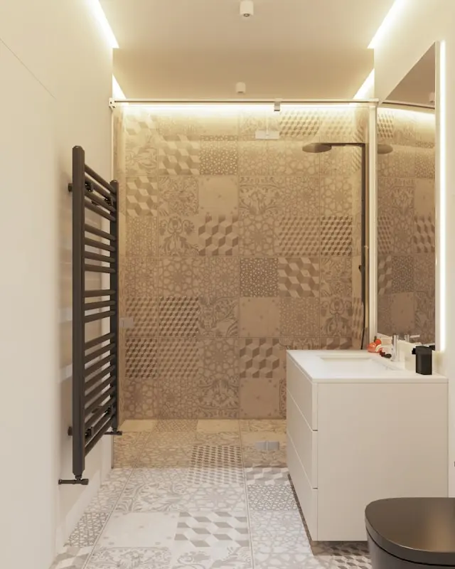
1. Zellige (The “Imperfect” Look)
Zellige is that glossy, slightly wobbly tile with uneven edges and depth of color. It looks handcrafted, even when it’s not.
Why it works:
- The uneven surface catches light differently across the wall, which stops an all-white bathroom from feeling flat.
- The tiny shade variations give you movement without needing bold color.
Where I like it:
- Shower walls, especially behind a niche.
- Behind the vanity as a feature wall.
If you’re nervous about color, choose an off-white or pale sand Zellige. You get the texture without committing to a bold hue.
2. Kit Kat / Finger Tiles
Kit Kat tiles are long, skinny “fingers” usually laid vertically. They are the fast track to “architect-designed” vibes.
Benefits:
- Height illusion: Vertical lines draw the eye up and make low ceilings feel higher.
- They add subtle texture without being busy.
Where to use them:
- On the vanity wall right up to the ceiling.
- In a shower niche only, if your budget is tight but you want a “designer” moment.
In my experience, Kit Kat tiles look best with simple, calm floors. Don’t pair them with heavy patterned floor tiles unless you really know what you’re doing.
3. Large Format Slab Tiles
Think 24×48 inches and up, with minimal joints. These tiles are about calm and scale.
Why they’re everywhere in 2026:
- Fewer grout joints = less cleaning and less visual clutter.
- They mimic stone slabs without the price tag.
Great for:
- Small bathrooms where you want the floor to feel like one continuous plane.
- Showers where you’d prefer to see tile, not grids of grout.
If you have a tight budget, I recommend investing in large format floor tiles and using a simpler, smaller tile on the walls.
4. Terrazzo
Terrazzo is the speckled tile made to look like chips of stone set in cement.
Why I still like it (when it’s done right):
- The speckle pattern hides dirt and hair better than flat solid tiles.
- It adds playfulness without feeling childish if you stick to a neutral palette.
Use it:
- On floors with plainer walls.
- On a shower floor paired with smooth walls for contrast in texture.
Don’t do terrazzo on every surface in a tiny bathroom. It becomes visual static. One plane is usually enough.
5. Wood-Look Porcelain
If you love spa or Scandinavian bathrooms, this is your best friend.
Why people choose it:
- All the warmth of wood, but waterproof and easy to clean.
- Works especially well in walk-in showers and on floors.
Design tip:
- Choose a plank with subtle grain and a matte finish. High-contrast “fake” grain can look cheap.
- Lay planks lengthways along the longest measurement of the room to stretch the space.
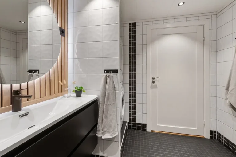
Layout Logic – It’s Not Just What You Buy, It’s How You Lay It
The same tile can look budget or high-end depending entirely on the layout. This is where most people under-think.
Vertical Stack
Rectangular tiles are stacked neatly on top of each other in a grid.
Result:
- Clean, modern, and height-enhancing when used vertically.
- Works beautifully with Zellige and Kit Kat tiles because it lets the tile shape and texture speak.
I recommend vertical stack for:
- Low-ceiling bathrooms.
- Narrow shower walls that you want to look taller, not wider.
Herringbone
Tiles are laid in a V-shaped zigzag. It’s classic and instantly looks “custom”.
Result:
- Adds movement and a sense of craftsmanship.
- Can make a simple subway tile look expensive.
Reality check:
- It’s more labour intensive. Your tiler will likely charge extra because every cut matters.
- Best used in one area only (for example, flooring or behind the vanity) to avoid visual overload.
If your budget is tight, I’d skip herringbone on floors and do it just in a feature panel.
Basketweave
Basketweave patterns are more retro and work well in older homes or vintage-inspired bathrooms.
Result:
- Cosy, nostalgic, and full of character.
- Pairs beautifully with shaker vanities and classic fixtures.
Use it if:
- You’re updating an older house and want to respect the original character.
- You love the “European hotel” style more than ultra-modern minimalism.
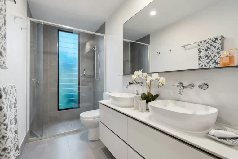
Material Guide – Stone vs Porcelain vs Ceramic
Choosing the wrong material can cost you more than choosing the wrong color.
Porcelain – The Hero
For most modern bathrooms, porcelain is the safest foundation.
Why I recommend it:
- It’s non-porous and very hard wearing.
- Current printing technology makes it convincingly mimic marble, limestone, concrete, or wood.
- Perfect for showers, floors, and family bathrooms.
If you’re overwhelmed, default to porcelain for any high-use area. You can always add a small real-stone accent if you want authenticity.
Natural Stone – The Diva
Marble, limestone, travertine, and slate are stunning, but they come with rules.
Key points:
- They’re porous, so they need sealing and gentle cleaning.
- They can stain or etch if you use harsh products or hair dye directly on them.
Where they work best:
- Low-traffic master ensuites where you’re willing to treat them kindly.
- Feature walls or niches rather than every surface.
In my experience, stone is about mood, not practicality. Use it where it will be admired, not abused.
Ceramic – The Workhorse (With Limits)
Ceramic tiles are usually cheaper and softer than porcelain.
Good for:
- Walls where there is less impact and load.
- DIY projects, because they are easier to cut and drill.
Not ideal for:
- Floors in high-traffic bathrooms.
- Shower floors where durability and water absorption matter.
If your budget is very tight, you can mix ceramic on the walls and porcelain on the floor to save money without sacrificing performance.
Small Bathroom Tile Hacks (Optical Illusions)
If your bathroom is small, your tile choices should be doing some visual heavy lifting.
Floor-to-Wall Continuity
Running the same tile from the floor up part or all of the wall blurs where the floor stops and the wall begins.
Why it works:
- Your eye reads the surfaces as one continuous plane, which makes the room feel bigger.
- It’s especially effective with large format tiles in stone or concrete looks.
I like taking the floor tile up the shower wall or behind the vanity, then switching to a lighter or glossier tile above that.
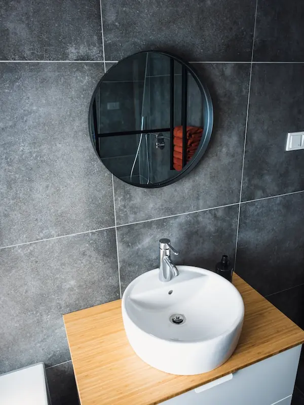
Gloss vs Matte
The finish of your tiles is as important as the color.
- Glossy tiles (walls):
- Reflect light and make the room feel brighter and more spacious.
- Easier to wipe clean of soap splashes.
- Matte tiles (floors):
- Provide more grip underfoot, which is important in wet zones.
- Hide water spots a bit better than shiny floors.
If you have a tiny, dark bathroom, consider glossy walls, a satin or matte floor, and warm LED lighting to keep it from feeling clinical.
The Secret Weapon – Grout
Grout is the design element everyone forgets until it’s too late. It affects both the look and longevity of your bathroom.
Contrast Grout
Dark grey grout with white tiles is a very graphic look.
Pros:
- Emphasizes the shape and pattern of the tile (perfect for subway or grid layouts).
- Hides minor stains and discoloration much better than white grout.
Cons:
- Any crooked lines will be much more obvious.
- Can push the look towards industrial if overdone.
I’d use true dark grout sparingly on walls where you really want that modern edge.
Matching Grout
Matching grout to the tile color is the opposite: soft and minimal.
For white tiles, the best grout color is rarely pure white. That’s the trap.
Instead, I usually recommend:
- A soft warm grey or “off-white” that blends with the tile yet hides everyday grime.
- If your tiles are warm white, choose a warm-toned grout; if they’re cool white, choose a cooler light grey.
This gives you that seamless, minimalist wall without the high-maintenance headache of bright white grout.
Epoxy Grout
If you hate scrubbing grout lines, epoxy is worth knowing.
Key advantages:
- Much more stain-resistant than cementitious grout.
- Creates a more waterproof joint, especially useful in showers.
Downside:
- It’s harder to work with, so your tiler may charge more.
In my opinion, if your budget allows only one “upgrade”, consider epoxy grout in the shower. It will save you years of annoyance.
FAQ
What is the best tile size for a small bathroom?
Surprisingly, large format tiles are usually better than tiny mosaics. Fewer grout lines make the floor look calmer and less busy, which visually expands the room. You can still use mosaics in a shower niche or a small accent if you love them.
Is matte or glossy tile better for a shower?
For walls, I prefer glossy or satin tiles because they reflect light and are easier to wipe clean. For floors, always choose matte or textured tiles to improve grip and avoid slipping.
How much extra tile should I buy?
Allow around 10–15% extra for off-cuts and breakage. If you’re doing a complex pattern like herringbone or working with lots of awkward angles, I’d go closer to 20% to avoid running short mid-install.
If you tell me your bathroom size, current light situation, and whether it’s a family or ensuite space, I can help you pick one hero tile, one layout, and one grout color that will work together instead of fighting each other.