Beige Living Room Ideas: How to Make Neutrals Look Expensive, Not Bland
Beige has a terrible reputation for being dull, but the truth is this: badly chosen beige is boring, well–chosen beige is luxury.
If your walls ever looked like a band-aid, or your “warm neutral” turned into a slab of butter at night, that is not your fault. It is an undertone and lighting problem, not a beige problem.
In this guide I will walk you through beige living room ideas that actually feel high-end: how to choose warm beige paint undertones, how to layer texture the way the best Japandi living rooms do in 2026, and how to light everything so it stays calm and elegant in every part of the day.
The “Band-Aid” Effect: Understanding Undertones
Most beige disasters come from one thing: ignoring undertones. Beige is not a single color; it is a family sitting between white, brown, yellow, red, and green. If you do not control that family, your living room controls you.
H3: The 3 Beiges
1. Yellow-Base Beige (Cream / Linen)
Yellow-based beiges lean warm and cheerful. They work beautifully in colder climates or north-facing rooms that need warmth.
Use them when:
- Your flooring is honey oak, light pine, or warm tile.
- You want a classic, slightly traditional living room.
Be careful if you already have very warm artificial light (lots of 2700K bulbs). Too much yellow in both paint and bulbs makes the room feel artificially warm, almost like you are inside a lampshade.
2. Red / Pink-Base Beige (Taupe / “Band-Aid” Tones)
This group includes taupe and some “greige” colors with a slight pink or red cast. They can feel romantic and cozy, especially with warm textiles and low light.
The risk: in daylight or with the wrong bulb, they can shift into band-aid territory and make skin tones look strange.
I only recommend pink-based beige when:
- Your sofa and rug are cool neutrals (stone, grey, greige) and you need some warmth on the walls.
- You test it in both morning and evening light and still like it.
If you see even a hint of dusty rose you dislike on the swatch, trust that instinct. It will be stronger on the wall.
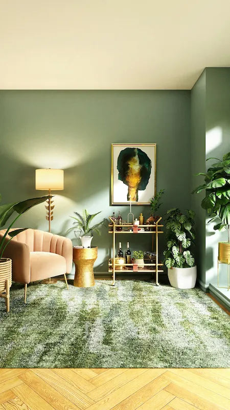
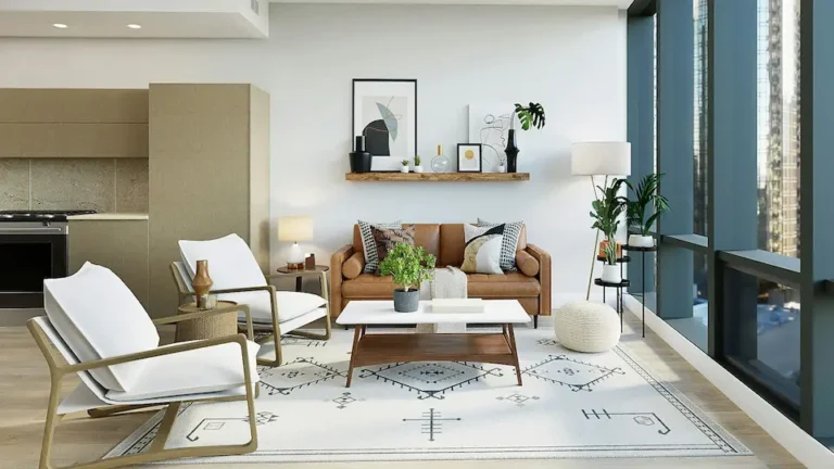
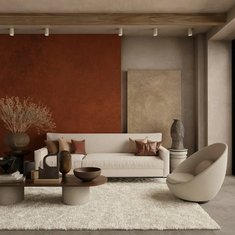
3. Green-Base Beige (Khaki / Stone)
Green-based beiges are the modern workhorses. They feel calm, sophisticated, and pair beautifully with wood and black accents.
They are ideal for:
- Japandi living room schemes in 2026 where you mix pale wood, black details, and organic textiles.
- Rooms with a lot of greenery, stone, or travertine.
They also handle changing daylight better than pink-based beiges. If you want a beige that feels timeless and expensive, I usually steer clients toward this category first.
Interactive Guide: How to Test Your Beige
Do this before committing to any paint, regardless of brand:
- Paint a large sample on card
- At least an A4 or letter-size piece, two coats.
- Do not test on a tiny swatch; your eye cannot read undertone that way.
- Compare it to pure white
- Hold a sheet of bright white printer paper against the sample.
- If the beige suddenly looks peachy or pink next to the white and you dislike that, cross it off.
- Move it around the room
- Tape the sample on three walls: one facing the window, one side wall, one darker wall.
- Look at it morning, midday, and night. If you still like it in all three, you have a winner.
This five-minute test saves you from repainting an entire living room because the beige turned strange at sunset.
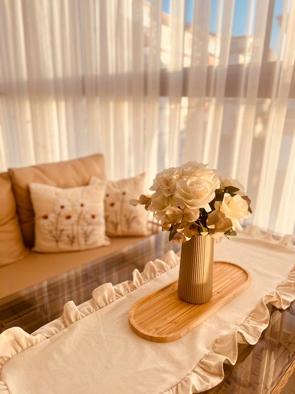
Beige Trends for 2026 (It’s All About Texture)
Beige is not interesting because of its hue; it is interesting because of how it interacts with light and texture. 2026 neutrals are less about plain flat paint and more about surface character.
1. Limewash and Plaster Finishes
Flat vinyl paint is starting to feel “rental standard.” Textured finishes like limewash, Roman clay, or subtle plaster effects give beige depth and movement.
I like them especially for:
- Accent fireplace walls in a neutral living room.
- Japandi living room ideas where you want a soft, cloudy backdrop for simple furniture.
The key is to stay in the beige family, not drift into heavy terracotta unless that is your full concept. Think stone, not fake old Tuscan.
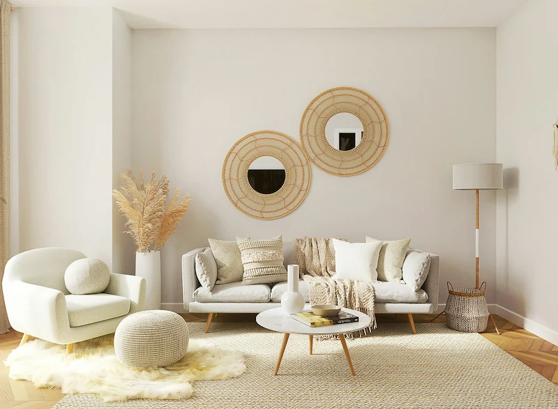
2. “Oatmeal” and “Cashmere” Beiges
The newer warm beige paint undertones are drier and more muted than the yellow creams of the 2000s. They sit between grey and brown, like unbleached linen or oatmeal.
These shades:
- Feel calm during the day and cozy at night.
- Work incredibly well with light oak floors and low, modern furniture.
If you want a beige living room that feels current but not trendy, aim for these softer, chalky tones.
3. Tone-on-Tone Walls, Trim, and Ceiling
Instead of white trim on beige walls, designers are shifting to tone-on-tone schemes. Walls, baseboards, doors, and even ceiling are painted in very close shades of the same beige strip.
Why this works:
- It removes visual chopping at every edge.
- It creates a cocoon effect that suits warm minimalism and Japandi.
You can keep the ceiling half a step lighter to avoid feeling compressed, but staying in the same undertone family is non-negotiable.
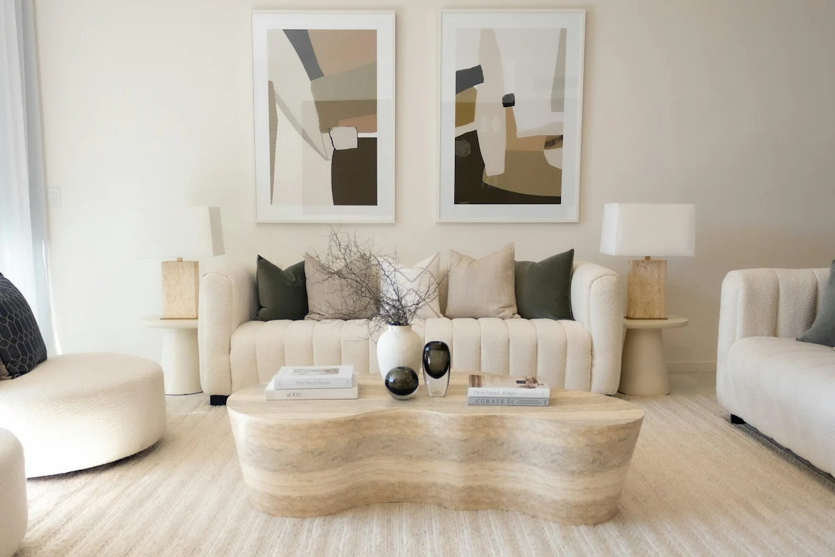
4. Travertine and Pale Stone Furniture
Travertine coffee tables, side tables, and plinths are back because they add real texture without adding color. Beige on beige on beige can be boring when everything is flat; introduce a porous, natural stone and suddenly the room feels intentional.
Just remember: one or two stone pieces are enough. Too many and the room can feel like a showroom. Balance stone with soft textiles and warm wood.
How to Layer Beige Without It Looking Flat
A beige living room only looks expensive when the textures are doing the heavy lifting. If everything is smooth and painted, it feels unfinished.
I like to use a simple rule with clients: if you can count at least five distinct textures in the room, the beige will read as “designed,” not “default.”
The 5-Texture Rule
Aim to include these five categories:
- Wood (Grain)
- Coffee tables, side tables, console, or exposed beams.
- Light oak for Japandi, mid-tone walnut for more contrast.
- Stone (Porous or Honed)
- Travertine side table, stone tray, or a mantlepiece.
- The small things count; even a stone bowl on a console adds depth.
- Textile (Soft / Nubby)
- Bouclé, linen, wool, or heavy cotton on sofas and cushions.
- Mix tight weaves with looser, hand-woven looks so everything doesn’t feel uniform.
- Metal (Patina)
- Aged brass, bronze, or blackened steel on lamps, handles, or side tables.
- This is where you quietly introduce a bit of shine among all the matt surfaces.
- Plant (Living Green)
- A tree in a corner, a simple leafy plant on a low table, or a modest arrangement on a shelf.
- Green breaks the monotony and instantly makes beige feel intentional.
Once you have these five, step back and check your balance. If something still feels flat, it is usually because all your wood is the same tone or all your fabrics are too smooth. Bring in one new texture, not more color.
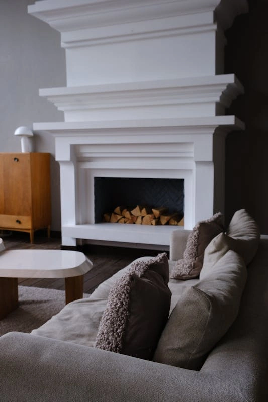
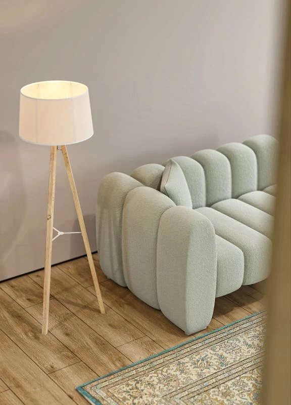
The “Black Anchor” Principle
Every beige living room needs at least one strong dark element. Without it, the room can feel like it is floating.
Good candidates for a black anchor:
- A floor lamp with a slim black stem.
- A black-framed mirror or artwork frame.
- A low black metal coffee table base with a lighter top.
I prefer slim, controlled doses of black rather than giant black sofas in a beige room. The goal is to define edges, not pull all attention to one heavy block of color.
What Colors Go With Beige in 2026?
Beige is a great team player. The trick is picking companions that match the undertone you chose earlier.
Beige + Olive Green: Organic Modern
This pairing is ideal for Japandi living room ideas in 2026. Beige walls, an olive throw, and a few olive-toned cushions give quiet contrast without shouting.
It works best with:
- Light oak furniture and black accents.
- Simple, clean lines and woven textures.
Beige + Burnt Sienna: Desert Calm
If you like a slightly richer palette, add terracotta, rust, or burnt sienna accents. Think cushions, art, or a single armchair.
This gives:
- A warm, sun-baked feeling without needing bright colors.
- Great contrast against oatmeal or taupe beige walls.
Beige + Charcoal: High Contrast Minimalism
A mix of soft beige and deep charcoal works well in more modern spaces. Charcoal sofas, dark stone tables, or a charcoal rug under a beige sofa give a graphic but still cozy look.
Just watch your proportions. If you have a charcoal sofa, balance it with lighter walls, a pale rug, and some mid-tone wood so the room doesn’t tilt too dark.
Beige + Pale Blue: Updated French Country
Pale, slightly dusty blue with beige feels timeless without being cute. It is perfect if you like a softer, layered aesthetic but want to avoid full grey.
Use blue in:
- Linen cushions, one accent chair, or a subtle patterned rug.
- Art with a muted blue sky or abstract brushstrokes.
The key is to keep the blue desaturated; bright navy can overwhelm gentle beige unless you intentionally want a sharp contrast.
Lighting Your Beige Room
Lighting makes or breaks beige. The same color can look rich and stony in one home and sickly in another, purely because of bulb choice.
The Kelvin Danger Zone
Most standard home bulbs sit somewhere between 2700K (warm white) and 3000K (warm but cleaner). With beige, that difference really matters.
- 2700K + Yellow-Based Beige
- This can easily tip into “butter room” territory.
- If your paint already leans yellow and you use very warm bulbs, the entire space can feel heavy and dated at night.
- 3000K + Beige
- Slightly cooler but still warm enough for a living room.
- This is usually my default recommendation for beige walls because it keeps them looking neutral rather than overly yellow.
If you already painted and it feels off, try changing bulbs before repainting. It is the cheapest correction.
Practical Lighting Tips for Beige Spaces
- Use at least three light sources in the room: ceiling, floor or table lamps, and one accent source (for example on a shelf).
- Avoid only using downlights. They can create harsh shadows and make beige walls feel flat. Adding lamps at eye level softens everything.
- Test your paint sample under the actual bulbs you plan to use. Turn all lamps on in the evening and check if the beige still feels like the color you chose, not a surprise cousin.
If you handle undertones carefully, layer real texture, and respect the Kelvin numbers, beige living room ideas suddenly stop being “safe” and start feeling quietly luxurious.
In my experience, neutral rooms age far better than bold ones when they are built on these principles. You can swap cushions, art, and small pieces as your taste shifts, but the bones stay calm, warm, and timeless.