Latest Kitchen Colour Combinations for 2026: Earthy Contrast and Two-Tone Layouts
If you’re planning a new kitchen or thinking about a serious refresh, the latest kitchen colour combinations for 2026 are very clear on one thing: the all-white box is over. Warm, grounded palettes are replacing cold greys, and two-tone kitchen trends for 2026 are all about contrast that still feels calm and natural.
Warm mushroom, olive greens, deep berry reds and soft creams are leading the way, often paired with wood and stone so the room feels designed but still livable. Recent trend reports are all pointing in the same direction: earthy, nature-inspired color with depth, not flat minimalism.
Let’s start with a quick snapshot before we get into the details.
Key Takeaways 2026: Kitchen Colour at a Glance
- The Shift: In 2026, the “all-white” kitchen is officially replaced by earthy contrast – warm neutrals, rich greens and reds, and soft off-whites layered with wood and stone instead of bright, sterile white everywhere.
- The It Colors: The most relevant hues you’ll see in new projects this year are
- Mushroom / greige (a warm grey-beige)
- Oxblood / deep burgundy
- Olive and mossy greens
- The 60–30–10 Rule for Kitchens:
- 60%: Main cabinets and wall colour (the “background”)
- 30%: Island, backsplash and major wood elements (the contrast)
- 10%: Hardware, lighting, bar stools and textiles (the accent)
If you keep that simple ratio in mind, it becomes much easier to decide where each colour belongs, instead of trying to spread everything everywhere.
The Palette Library: Latest Kitchen Colour Combinations by Style
Rather than throwing a list of random paint names at you, I prefer to build full “recipes” you can actually apply. Each of these kitchen palettes uses the same basic structure:
- One main cabinet colour
- One island or secondary colour / material
- One countertop or backsplash choice
- A simple accent plan
You can then adjust the exact shades within that framework to suit your light and your budget.
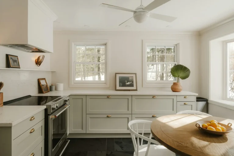
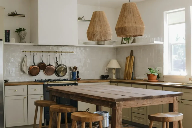
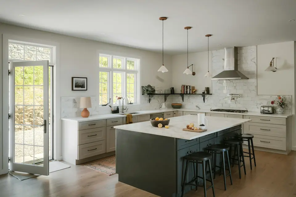
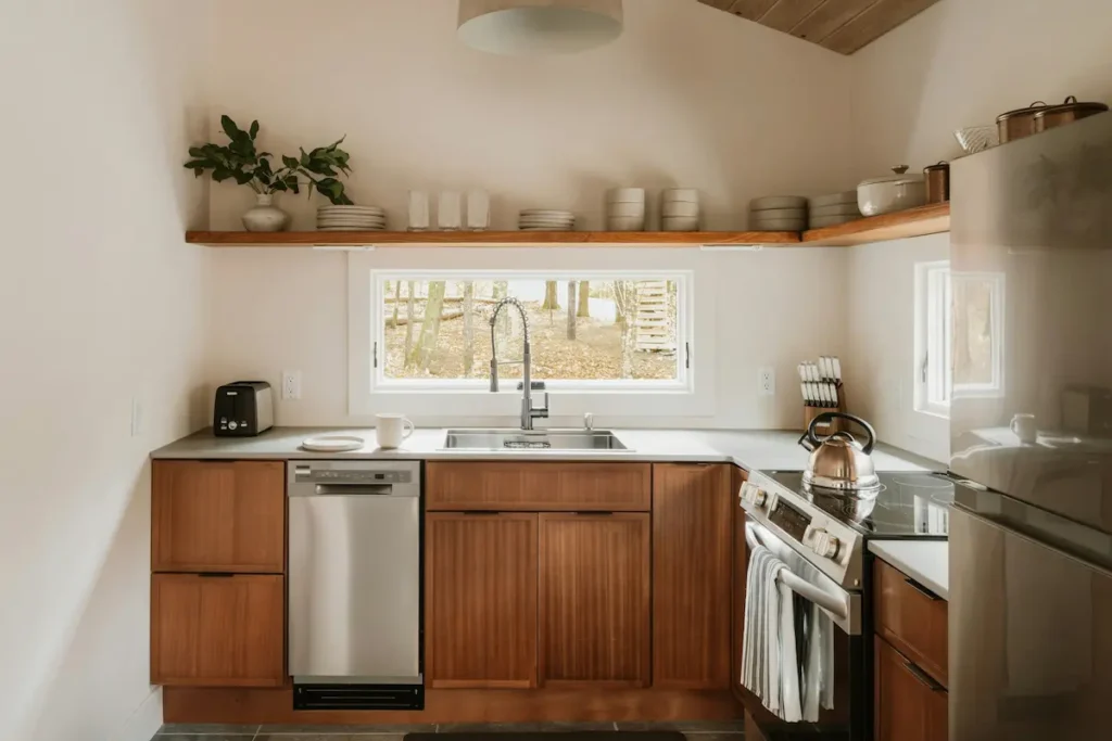
The “Organic Modern” Palette (Warm Neutrals)
This is the easiest entry point if you’re nervous about committing to colour but don’t want another all-white kitchen. The look is calm, earthy and quietly modern.
The Recipe:
- Base cabinets: Mushroom / greige (warm grey-beige)
- Think shades similar to Sherwin-Williams “Accessible Beige” or a soft mushroom with a brown rather than blue undertone.
- Island: Light white oak or pale ash wood, either stained or left close to natural.
- Worktops: Cream or warm white quartz with subtle beige or taupe veining.
- Walls: Soft warm white, not crisp gallery white.
- Hardware: Brushed nickel or champagne brass, both work well with greige.
Why this works:
- Mushroom cabinets instantly warm up the room but still behave like a neutral. They anchor the space without feeling dark or heavy.
- A lighter wood island keeps the kitchen from looking blocky. It almost reads as furniture, which is especially helpful in open-plan spaces.
- Warm white quartz ties everything together and reflects light back into the room, which is important if you’ve lost the reflectivity of full white cabinetry.
Where I like to use it:
- Homes that get strong sunlight during the day; this palette softens glare instead of bouncing it around.
- Small or mid-size kitchens where full dark cabinets might feel too heavy.
If you already have white or off-white wall cabinets, you can still move toward this look by painting just the lowers in a mushroom shade and swapping in wood-toned stools or open shelving.
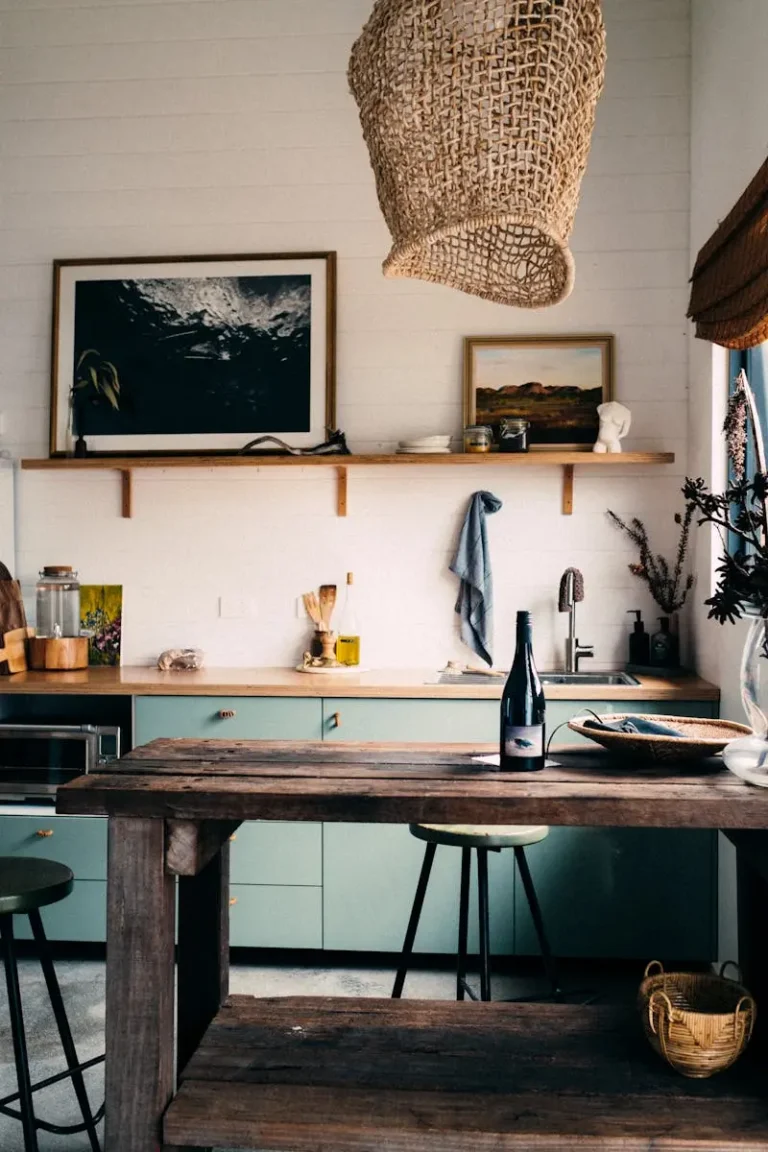
The “Moody Luxe” Palette (Dark & Dramatic)
If you love the idea of a kitchen that feels like a tailored suit – clean, sharp and slightly dramatic – this is the combination to look at.
The Recipe:
- Base and tall cabinets:Charcoal or midnight blue
- Think Benjamin Moore “Hale Navy” or a deep charcoal that reads almost black but still has a visible undertone.
- Island: Rich walnut or another mid-to-dark wood.
- Worktops: Honed marble-look quartz or real stone in off-white with soft warm veining.
- Walls: Warm white or very pale greige so the cabinets still read as the main event.
- Hardware and fixtures: Unlacquered or brushed brass, kept simple and linear.
Why this works:
- Deep blue or charcoal cabinets create that cocooning feel a lot of people are looking for now, especially in homes where the rest of the spaces are softer and lighter.
- Walnut adds warmth and texture so the dark doesn’t feel flat. The grain is what keeps this combination from looking too stark.
- Brass hardware brings a small but important hint of glow. In my experience, this is what makes a dark kitchen feel inviting instead of brooding.
Design notes:
- In a small kitchen, I usually keep uppers lighter (even warm white) and confine the deep colour to base units and the island.
- Good lighting is essential here – aim for warm bulbs around 2700–3000K so the dark colours feel rich rather than dull.
The “New Retro” Palette (Playful and Light)
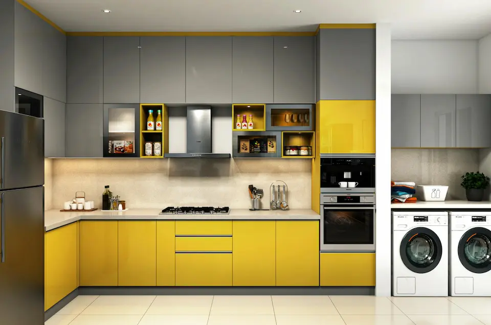
This is where the two-tone kitchen trends for 2026 get a little more playful. There’s a clear move toward softer, nostalgic colour – think butter yellow and terrazzo – but in a very edited way.
The Recipe:
- Base cabinets: Soft butter yellow (not neon, not lemon – something creamy and warm).
- Island or uppers: Clean white or a very soft putty tone so the yellow doesn’t take over.
- Worktops: Terrazzo or terrazzo-look quartz with gentle flecks (warm grey, sand, a bit of terracotta).
- Walls: Warm white or a barely-there peach.
- Hardware: Chrome or stainless steel for a subtle retro nod.
Why this works:
- Butter yellow instantly lifts a kitchen without becoming tiring; it’s much kinder on the eyes than primary yellow.
- Terrazzo adds pattern and personality in a way that is surprisingly practical: it hides crumbs, minor marks and the general reality of a working kitchen very well.
- Chrome and stainless steel echo vintage appliances and taps, so the whole space feels deliberately “new retro” instead of accidentally dated.
Where to use it:
- Apartments or smaller homes where the kitchen is visible from the living area and you want it to feel cheerful.
- Family homes where the kitchen doubles as homework zone or craft table; the colour helps the room feel friendly rather than formal.
You don’t have to commit to all three components at once. Even pairing butter yellow base cabinets with a simple white quartz and kitchen-safe art in retro colours can move your space in this direction.
How to Match Countertops with Cabinet Colors
This is the part I see people struggle with most. You pick a cabinet colour you love, then you stand in front of endless stone and quartz samples and suddenly everything looks wrong.
A simple rule that saves a lot of headaches: match temperatures, contrast values, or both.
1. Warm Cabinets = Warm Counters
If you choose a warm cabinet colour – mushroom, taupe, cream, olive-green – stay with countertops that have warm veining or inclusions.
- With mushroom / greige cabinets, look for:
- Cream or off-white quartz with taupe or beige veining.
- Light travertine-look surfaces with a gentle sandy undertone.
- With olive or sage green cabinets:
- Soft white or very pale greige with gold or light brown veining works beautifully.
- Avoid counters with sharp, cool grey or blue veining; they will fight with the green and feel disjointed.
In person, lay a cabinet door sample directly on top of the countertop slab. If the overall effect feels calm and blended, you’re on the right track. If one looks dirty or the other suddenly looks too yellow, there’s a temperature mismatch.
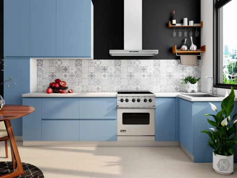
2. Dark Cabinets = Either Light Contrast or Tone-on-Tone
With charcoal, forest green or navy cabinets, you have two safe options:
- High contrast:
- Pair with light counters (off-white or light stone) so the surface reflects light and keeps the kitchen usable.
- This works especially well in smaller rooms.
- Tone-on-tone:
- Use a deeper stone, but make sure it has movement (veining or pattern) so it doesn’t read as one heavy block.
- For example, charcoal cabinets with a soapstone-look quartz that has soft white and green veining.
What I generally avoid:
- Cool blue-grey marbles with warm beige cabinets. The cabinet will suddenly look “dirty” next to the countertop.
- Very busy veining with playful cabinet colours (like butter yellow). In that case, keep one element quiet.
3. Don’t Forget Finish and Edge
- Polished counters reflect more light and feel slightly more “formal.”
- Honed or matte counters hide fingerprints and suit organic modern palettes better.
- For most contemporary kitchens, I like a simple square edge or slightly eased edge. Thick, heavily profiled edges tend to date a kitchen quickly unless the entire space is very traditional.
Two-Tone Kitchens: The Island Anchor Rule
Two-tone kitchen trends in 2026 are not about randomly painting some cabinets dark and some light. The most successful examples use contrast to create a clear centre of gravity in the room, and that usually means one thing:
The island should almost always be the darker or visually heavier element to anchor the space.
Why the Island Should Be Darker
- The island is already the visual centre of most modern kitchens. Giving it a deeper colour or richer wood reinforces that naturally.
- Wall cabinets and tall units often sit against lighter walls and ceilings, so keeping them lighter helps the room feel taller and less boxed in.
- A darker island hides scuffs, shoe marks and day-to-day life far better than a pale surface.
Practical examples:
- Organic modern:
- Mushroom wall cabinets
- White or very light oak tall units
- Slightly darker oak or walnut island
- Moody luxe:
- Off-white or pale greige uppers
- Deep navy or charcoal base cabinets
- Even deeper charcoal or dark walnut island
- New retro:
- Butter yellow base cabinets against the wall
- Clean white island with a darker wood or terrazzo top so it still feels grounded
When You Might Break the Rule
There are a few situations where I soften this guideline:
- Very small kitchens with a tiny island or peninsula
In that case, keeping the island the same colour as the base cabinets can make the room feel calmer and less bitty. - Galley kitchens with no true island
You can use the darker colour on one run of cabinets (usually the side without tall units) instead of an island.
Even then, I keep the idea of “anchor” in mind: there should always be one element that quietly holds the room, whether it’s the island, a tall pantry wall, or a deep-toned range wall.
The 60–30–10 Rule Applied to Two-Tone Kitchens
Here’s how the classic design ratio works practically when you’re planning the latest kitchen colour combinations:
- 60% (Background):
- Main cabinet colour (often the lighter one)
- Wall colour
- Ceiling
- 30% (Anchor / Contrast):
- Island colour (often darker)
- Tall pantry or fridge surround
- Major wood elements like beams or a large open shelf
- 10% (Accent):
- Hardware (handles, knobs)
- Lighting (pendants, sconces)
- Stools, textiles, small appliances, and art
If you’re ever unsure whether you’re overdoing a bold colour, check it against this ratio. If your “30%” shade is starting to creep into half of the room, pull it back to the island and one or two supporting elements.
Final Thoughts: Choosing a Palette You’ll Still Love in Five Years
Trend reports are helpful, but your kitchen has to live with your routines, your light, and your cooking habits, not just a mood board.
A few quick checkpoints before you lock in your choices:
- Look at your natural light. Earthy greens and deeper reds are stunning, but they need either daylight or very good warm artificial lighting to read properly.
- Test samples in large swatches – cabinet doors, A4 paint cards, real stone or quartz offcuts – and look at them morning, afternoon, and night.
- Think about maintenance. Slightly creamy quartz and mid-tone woods often age better visually than pristine white or ultra-dark surfaces that show every crumb.
The latest kitchen colour combinations for 2026 give you