Living Room Interior Design: The Comprehensive Guide to Principles, Layouts & Styles (2026)
Truly well-designed living rooms aren’t just collections of expensive furniture; they are the result of mastering scale, light, and flow.
If you’ve ever bought a gorgeous sofa and rug and still felt like something was “off,” it’s not your taste. It is the underlying living room interior design principles that are missing: how big pieces should be, where they go, and how the room leads your eye.
Successful living room interior design relies on five core principles: Balance (distributing visual weight), Scale (furniture size relative to the room), Rhythm (repeating elements), Emphasis (creating a focal point), and Harmony (cohesive mood). I’ll walk you through each of these, plus exact measurements for walkways and layouts that designers quietly follow but rarely explain.
Interior Design vs. Interior Decorating: What Is the Difference?
Before we get into rules and layouts, it helps to separate interior design from decorating. Most people mix them up, and that’s where confusion starts.
Interior design looks at how a space functions and flows. Decorating focuses on how it looks on the surface.
Here is a quick comparison you can refer back to:
| Aspect | Interior Design | Interior Decorating |
|---|---|---|
| Focus | Structural planning and layout | Finishing touches and styling |
| Core Concern | How people move, sit, talk, work, and relax in the room | How the room looks in photos and in person |
| Elements | Traffic flow, proportions, lighting plans, focal points, built-ins | Furniture, rugs, cushions, curtains, accessories |
| Changes Involve | Possibly moving walls, changing door openings, electrical plans | Swapping rugs, paint colors, art, and textiles |
| Goal | Functional, safe, and efficient space | Aesthetic cohesion and personality |
When you understand that design comes first and decor second, your decisions become much easier. You stop wondering which cushion to buy and start asking: “Does my layout even support conversation, TV watching, and circulation yet?”
The 5 Principles of Design (Decoded for Real Homes)
These interior design principles for living rooms sound “academic” on paper, but in practice they are very simple. Once you see them, you cannot unsee them.
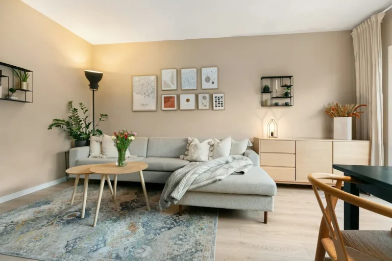
1. Scale and Proportion
Scale is the size of objects in relation to the room. Proportion is how objects relate to each other.
In practice, this looks like:
- A coffee table that is about two-thirds the length of your sofa.
- A rug that allows at least the front legs of all main seating to sit on it.
- Side tables that are roughly level with or slightly below the arm of the sofa.
If the sofa is huge and the rug is tiny, the room will always feel “off”, no matter how beautiful your decor is. In my experience, fixing scale and proportion has more impact than any new paint color.
2. Balance
Balance is about distributing visual weight so one side of the room does not feel heavier than the other.
There are three main types:
- Symmetrical balance (formal)
Mirror-image layouts: two matching sofas, twin lamps, identical chairs. This is calming and traditional. It works well around a fireplace or centered TV. - Asymmetrical balance (casual)
Different objects with similar visual weight: a large sofa on one side, balanced by two armchairs and a floor lamp on the other. This feels more relaxed and modern. - Radial balance
Objects arranged around a central point, like chairs around a round coffee table. This is useful in rooms with a circular rug or centered feature.
When you feel your living room “leans” visually to one side, it is often a balance problem.
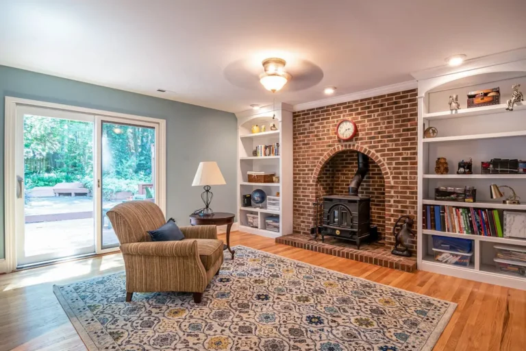
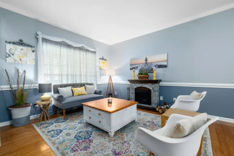
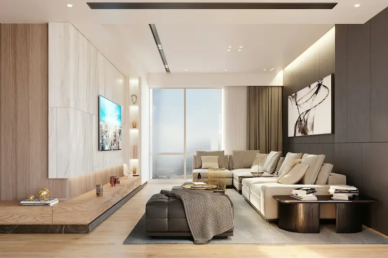
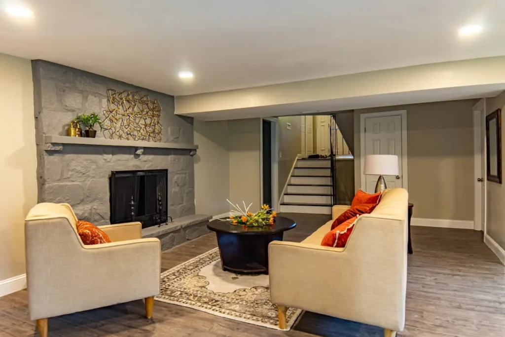
3. The Focal Point
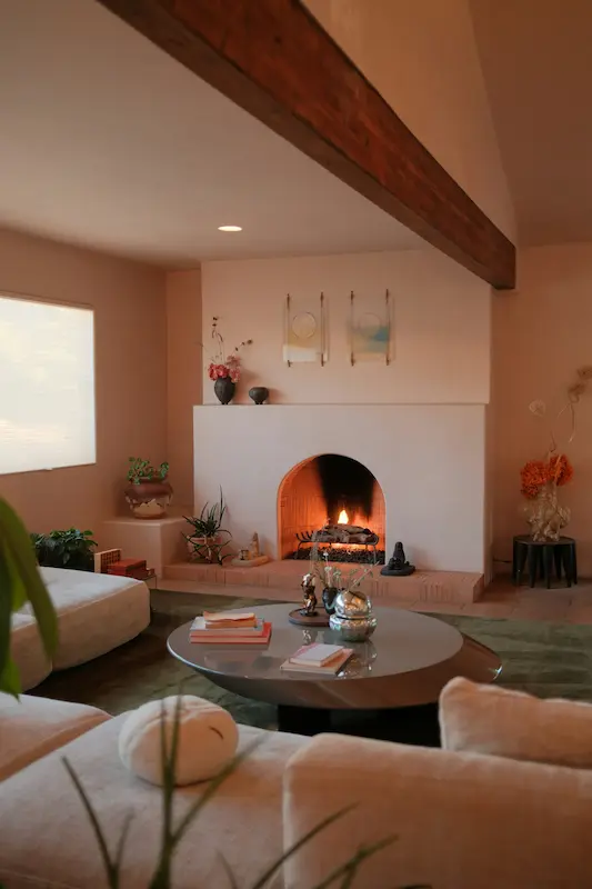
A focal point is the place your eye naturally goes first. Focal points in living room design are crucial because they stop the room from feeling chaotic.
Common focal points include:
- A fireplace
- A large window or beautiful view
- A TV wall
- A large piece of art or built-in shelving
Your main seating should face or embrace this focal point. For example, in a TV-focused room, the sofa should center on the TV wall, not on a random corner.
If you have multiple strong focal points (like a fireplace and a TV), I usually recommend:
- Aligning the TV above the fireplace if proportions and viewing height allow, or
- Choosing one to be dominant and treating the other as secondary with softer styling.
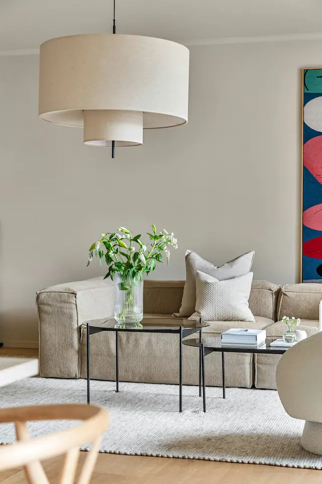
4. Rhythm and Repetition
Rhythm comes from repeating elements so the eye moves smoothly through the room.
You can create rhythm by repeating:
- A color (for example, small touches of black in frames, lamp bases, and hardware).
- A texture (linen cushions, a linen lampshade, and a linen-look curtain).
- A shape (rounded coffee table, curved chair backs, circular mirror).
In my experience, rhythm is what makes a room feel “pulled together” rather than like a random collection of pieces.
5. Negative Space
Negative space is simply empty space used on purpose.
A common mistake is filling every corner with something “just to use the space.” In reality:
- A blank stretch of wall can give breathing room to a dramatic piece opposite it.
- Leaving a clean corner or gap between furniture can make the room feel larger and more high-end.
I like to tell clients: if you’re unsure, leave more space, not less. Negative space is a design element, not a failure to decorate.
The Design Process: A Step-by-Step Workflow
Let’s turn those principles into a practical sequence you can actually follow.
Step 1: The Floor Plan
Start with measurements, not mood boards.
- Measure the room length, width, and note the location of doors, windows, and radiators.
- On your plan, mark clear walkways of 30–36 inches (about 75–90 cm) around and between furniture.
If a piece forces you to squeeze past with less than that, it is likely too large or in the wrong place.
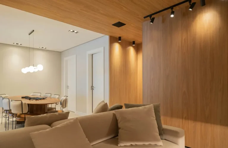
Step 2: The Lighting Plan
Most living rooms rely on a single ceiling light, which flattens everything.
Aim for three layers:
- Ambient lighting: General overall light (ceiling lights, track lighting).
- Task lighting: Reading lamps near seating, desk lamps.
- Accent lighting: Wall sconces, picture lights, small lamps highlighting shelves or art.
A simple upgrade is adding two floor or table lamps on separate switches from the main ceiling light. It instantly feels more designed.
Step 3: The Anchor Pieces
Choose your anchor pieces before anything else:
- The sofa
- The rug
The sofa defines the functional area. The rug defines the visual boundaries.
In my experience, trying to fit a sofa and rug around existing small pieces (like side tables or decor) leads to compromise. Start with the big items, then layer downward.
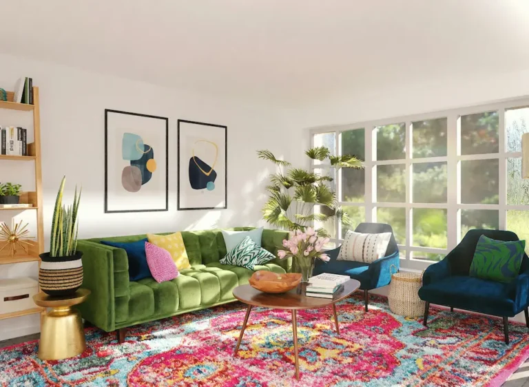
Step 4: The Palette – Using the 60-30-10 Rule
A classic and still very useful rule:
- 60% main color: walls, large rug, large sofa.
- 30% secondary color: accent chairs, curtains, side tables, smaller rug details.
- 10% accent color: cushions, art, small decor.
This is not about being rigid. It is about avoiding the “patchwork” effect where every item is a different color and nothing feels grounded.
Layout Configurations for Every Shape
Different living room shapes call for different layout strategies. Here are three common setups and how to handle them.
The “Conversation Circle”
Ideal for:
- Rooms without a dominant TV
- Spaces where hosting and conversation are the main priorities
How to arrange it:
- Two sofas facing each other, or
- One sofa and two armchairs facing each other across a coffee table.
Leave 30–36 inches around the perimeter so people can move freely. The focal point in this case is the conversation area itself, sometimes anchored by a fireplace or large artwork.
The “L-Shape” Open Concept
Common in:
- Combined living/dining areas
- Apartments where one large room serves multiple functions
Key strategies:
- Use a rug to define the living zone.
- Place an L-shaped sectional or sofa plus chaise to subtly “frame” this area.
- Position the back of the sofa as a gentle divider between living and dining spaces if needed.
The goal is to create clear zones while keeping the line of sight open so the room still feels unified.
The “Pass-Through” Room
This is the tricky one: doors on multiple walls, maybe a hallway slicing through the living room.
The main rule is: respect the traffic path.
- Map the natural route from one door to the other.
- Do not block this path with major furniture.
- Float the seating area slightly off the walls if needed, with the coffee table and rug forming a tight, comfortable island.
In pass-through rooms, I often use slim-profile sofas and armless chairs to keep that flow feeling easy and intentional.
Defining Your Style (The Visual Section)
Once the principles and layout are clear, style is the “filter” you apply to them.
You can think of style as the personality layer that sits on top of solid design.
Here are a few popular living room directions you might recognize:
- Modern
Clean lines, low furniture, neutral palettes, and minimal ornamentation.
Works beautifully with large windows and open floor plans. - Transitional
A blend of traditional shapes (like rolled arms or paneled furniture) with modern fabrics and simpler detailing.
Ideal if you like a soft, timeless look without feeling too formal. - Maximalist
Bold color, pattern mixing, layered textiles, and lots of curated objects.
Even here, the same principles apply: you still need balance, rhythm, and a clear focal point, or it just feels messy.
Your style can evolve, but your foundational interior design principles for living rooms will stay useful for years.
Common Design Mistakes to Avoid
These are the errors I correct most often in real homes.
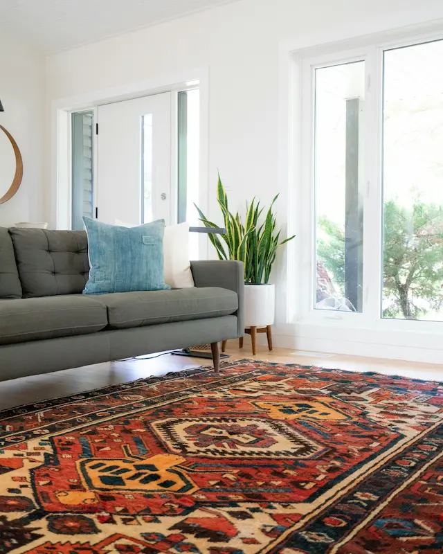
“The Rug Is Too Small”
This is the number one issue.
A rug that floats in front of the sofa like a mat makes the room feel smaller and disconnected.
As a rule of thumb:
- Aim for a rug where front legs of sofas and chairs sit on the rug.
- In larger rooms, go even bigger so all legs are on the rug.
If you are choosing between “a little too big” and “a little too small,” I would always choose too big.
“Pushing Furniture Against Walls”
Lining all furniture around the perimeter creates what I call the “waiting room” effect.
Instead:
- Float the sofa off the wall by even 5–10 cm if possible.
- Bring the seating cluster closer together around the coffee table.
This instantly makes the room feel more intimate and designed.
“Hanging Art Too High”
Art that is placed too close to the ceiling disconnects it from the furniture.
Use this guide:
- The center of artwork should be roughly 57–60 inches (145–152 cm) from the floor.
- Above a sofa, keep the bottom of the frame about 15–20 cm above the back.
Think of the art as part of the furniture grouping, not as an isolated afterthought.
FAQ: Living Room Interior Design
How do I start designing a living room from scratch?
Start with function, not shopping.
- Clarify how you use the room: TV, reading, hosting, working, or a mix.
- Measure and sketch a floor plan, marking doors and windows and planning walkways of 30–36 inches.
- Choose anchor pieces: sofa and rug first, then add a coffee table and key lighting.
- Only then layer in side tables, cushions, and decor.
If you follow that order, you avoid impulse purchases that do not fit or support the way you actually live.
What is the golden ratio in interior design?
The golden ratio (roughly 1:1.6) is a classical proportion that feels naturally pleasing to the eye.
In living room design, you’ll see similar logic in:
- A coffee table that is about two-thirds the length of the sofa.
- A gallery wall where one larger piece sits with smaller pieces grouped at around that proportion.
You do not need to calculate exact numbers, but keeping relationships close to that balance tends to create harmony without you even thinking about it.
How can I design my living room like a professional?
Designers don’t have magic furniture stores. What they have is a repeatable process and the confidence to leave space.
To get closer to a professional result:
- Respect the principles of balance, scale, rhythm, emphasis, and harmony.
- Commit to a clear focal point and arrange seating around it.
- Choose a rug and sofa in the correct proportions before worrying about cushions.
- Edit. If something feels off, remove one item before adding another.
In my experience, the difference between an “okay” living room and a beautiful one is rarely a single expensive item. It is how intentionally the elements are placed, lit, and given room to breathe.