Living Room Shelving Ideas: How To Add Storage, Style And Structure In 2026
You don’t have a “stuff” problem. You have a shelving problem.
In most living rooms I walk into, the walls are either totally blank or overloaded with random bookcases and floating planks that sag in the middle. When your storage isn’t planned, clutter spreads to every surface.
In this guide, I’ll walk you through living room shelving ideas that actually solve that problem: where shelving should go, what type to choose, how high to space shelves, and how to style them so they look intentional instead of messy.
I’ll follow the outline exactly, but I’ll talk to you like I’m in your living room with a tape measure in one hand and a mug of tea in the other.
The 4 Categories of Living Room Shelving
Before we get into trends and styling, we need a simple map. Almost every shelving solution you see falls into four types. Once you know which “family” you’re working with, decisions get much easier.
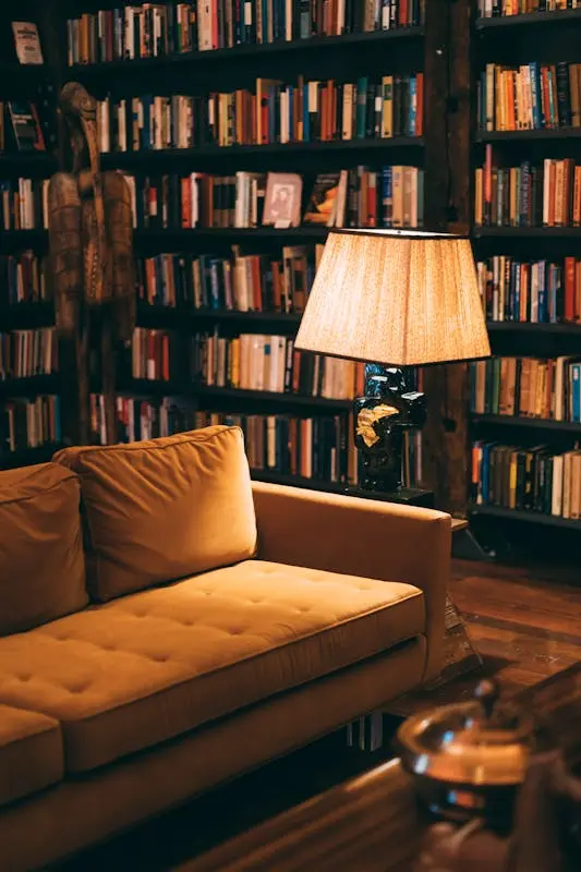
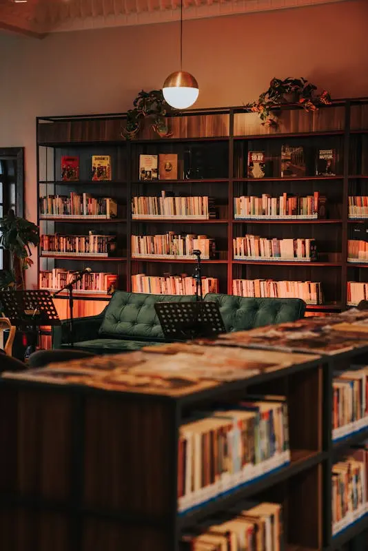
1. The “Built-In” (Permanent)
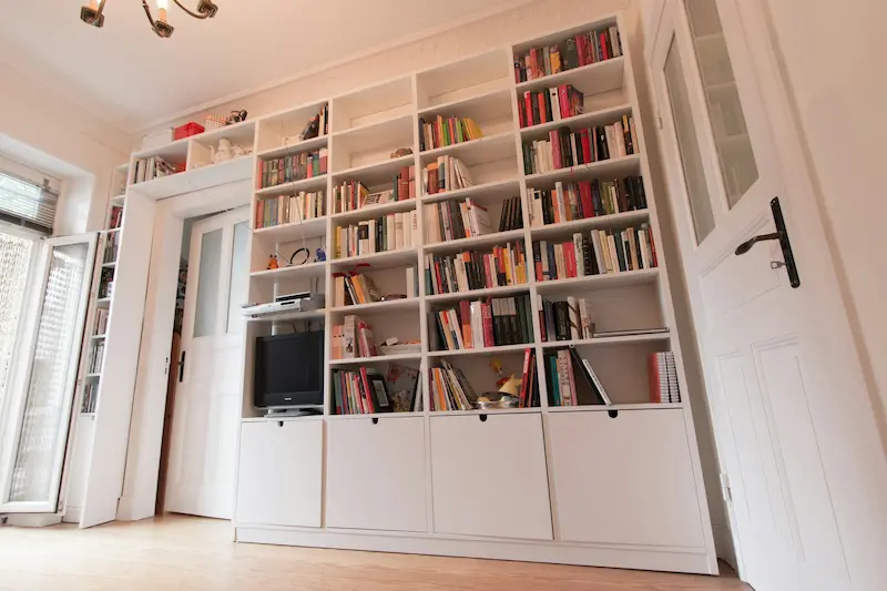
Built-ins are the architectural option. Think floor-to-ceiling shelves filling an alcove, framing a fireplace, or running the entire length of a wall.
When I recommend built-ins:
- You own the home or plan to stay long-term.
- You have awkward alcoves beside a chimney breast or a TV wall that feels unfinished.
- You want shelves that feel like part of the house, not a piece of furniture pushed against the wall.
Key advantages:
- Max storage per square metre because you can use the full height and width.
- Cleaner look, especially if you add doors on the bottom and open shelves on top.
- Adds perceived value to the home because it reads as custom joinery.
Potential downsides:
- Higher up-front cost.
- Not easily movable, so you need to plan carefully before committing.
If you’re considering built-ins in alcoves, I usually prefer going wall-to-wall and as high as possible, instead of “short” units that stop at chest height. Short units often make ceilings feel lower and waste vertical space.
2. The “Floater” (Minimalist)
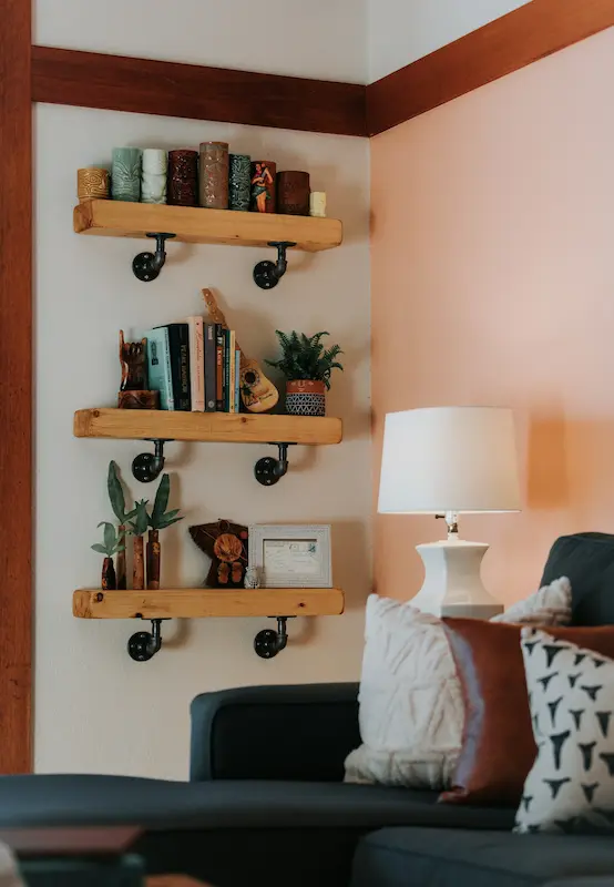
Photo by Zane Persaud on UnsplashFloating shelves are the lightest-looking option. Brackets are hidden inside the shelf, so the wood appears to grow straight out of the wall.
They work best when:
- The room is small and you can’t afford heavy, bulky furniture visually.
- You only need to store lighter items (books, decor, small plants).
- You want that clean, modern, “nothing touches the floor” look.
In my experience, floating shelves look best in controlled groups rather than dotted randomly:
- A stack of three shelves above a media console.
- A pair of long shelves above a sofa.
- A single strong line running over a low cabinet.
About weight limits: most floating shelves can only hold their advertised maximum if they’re installed into wall studs and the shelf itself is solid and thick. Don’t assume “floating” equals “load-bearing.” If you want to store heavy books or speakers, I’d rather see you use visible brackets or built-ins with proper support.
3. The “Modular” (Flexible)
Modular systems are the in-between: more substantial than simple floating shelves, but still renter-friendly and reconfigurable. Think of rail-and-bracket systems or track-based shelving that you can move and adjust.
I like modular shelving when:
- You might move home in a few years.
- Your needs change (kids’ toys now, home office later).
- You want shelves, a desk, and maybe a cabinet integrated into one system.
Advantages:
- Adjustable shelf heights with no drilling a new hole every time.
- You can start small and add units as your budget allows.
- Easier to install than full custom joinery.
The trick with modular systems is to keep the colour palette calm: white on white, or light wood on a light wall. That stops the system from looking “busy” and keeps the focus on your things, not the hardware.
4. The “Partition” (Zoning)
Partition shelving is one of my favourite living room shelving ideas for open-plan spaces. These are open-backed bookcases or shelf units used as room dividers between the living area and dining area, or between a sofa and an entry zone.
They’re ideal when:
- You live in a studio or open-plan flat that needs clear zones.
- You don’t want to build actual walls.
- You still want light to pass through.
Design tips:
- Choose open or lightly framed shelves so they don’t block light.
- Keep heavy storage in the bottom half (closed baskets, boxes) and smaller decor up top to avoid a “top-heavy” feeling.
- Align the height roughly to just above sofa-back level or a bit higher; going too tall can make the room feel chopped in half.
Used well, partition shelves make the living room feel like its own room, without sacrificing openness.
H2: Shelving Trends Taking Over in 2026
Trends should support function, not replace it. But knowing what’s current helps your living room feel fresh rather than stuck in 2010. Here’s what I’m seeing everywhere right now.
1. Curvilinear Joinery
Straight lines will always be classic, but 2026 is very kind to curves. Shelves with rounded front edges or softly curved side panels instantly soften the room.
Where I like them:
- In living rooms already heavy on straight lines (sectionals, TV, rectangular rug).
- In organic modern or Japandi spaces where you’re mixing natural textures with clean forms.
Stick to simple curves: a rounded outer corner or an arched niche. Overly ornate shapes start to feel themed rather than timeless.
2. “Quiet” Shelving For Acoustics
If your living room has hard floors, high ceilings, and feels echoey, shelving can actually help with sound.
“Quiet” shelving means:
- Shelves backed with cork, felt, or fabric panels.
- Closed cabinets at the bottom filled with textiles, board games, and soft items that absorb sound.
- Less glass and metal, more wood and fabric.
In my experience, adding one wall of “soft” shelving calms a noisy living room more than yet another rug. It’s an underrated way to make the room feel comfortable.
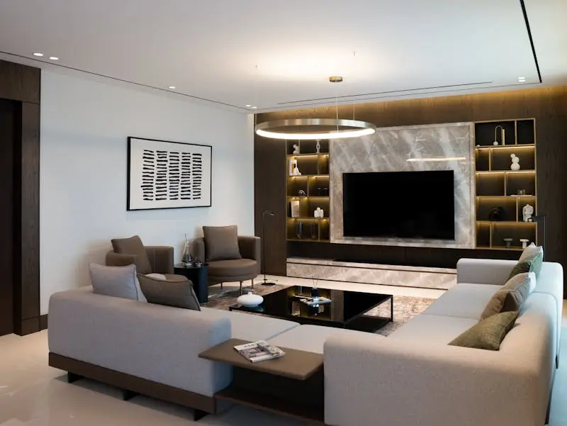
3. The “Hybrid” Wall
You’ll see this a lot in high-end projects: a lower run of closed cabinets with open shelving above. It’s the best of both worlds and works beautifully around TVs and fireplaces.
Why I recommend it:
- Ugly items (routers, cables, toys, random chargers) disappear into the closed base units.
- Pretty items (books, ceramics, framed photos) live on the open shelves.
- Visually, the solid base makes the room feel grounded, while the upper shelves keep it from feeling heavy.
If you only take one shelving trend into your home, this is the one I’d pick.
4. Integrated Lighting
Integrating LED strips into shelving is no longer a luxury only for show homes. Done properly, it’s both practical and beautiful.
How to do it well:
- Warm white light only (around 2700K–3000K) so your shelves feel cozy, not like a shop display.
- Place lighting toward the front underside of the shelf to wash light down the objects.
- Avoid visible dots by using diffusers or channels instead of bare LED tape.
I’d rather see one section of shelves lit properly than every single shelf glowing. Choose the area you want to highlight and keep it intentional.
Design Rules & Measurements
You don’t need to obsess over millimetres, but a few good rules save you from wasted space and sagging boards.
The “Vertical Gap” Rule
Shelf spacing is where most DIY jobs go wrong. Too close and nothing fits; too far and everything looks sparse and awkward. Here’s a simple cheat sheet I use on most projects:
- Paperbacks: Plan 9–10 inches of vertical space.
- Standard hardbacks and art books: Aim for 14–16 inches.
- Decor, vases, sculptural pieces: Allow 18 inches or more so they don’t look cramped.
You don’t need every shelf to be the same height. In fact, I prefer mixing: two tighter rows for books, then one taller bay for decor, then repeat. This gives rhythm and keeps the shelves from feeling like a warehouse.
If you’re building alcove shelving, sketch the vertical gaps before you drill anything. It’s much easier to adjust on paper than to move a dozen wall plugs.
The “Weight” Check
Shelf strength isn’t about luck; it’s about material, thickness, and how it’s fixed to the wall.
A few simple rules I use with clients:
- Solid wood (or high-quality plywood) is stronger and sags less than thin particleboard. If you want long shelves filled with books, invest here.
- Shorter spans are your friend. If you’re worried about sagging, add a centre support or use two shorter shelves rather than one long one.
- Always check the manufacturer’s maximum load and how it needs to be mounted. The same shelf can hold very different weights depending on whether it’s fixed into studs or hollow drywall.
For very heavy loads (records, big art books, stone objects), I often recommend French cleats: a pair of interlocking angled boards that spread the weight across a wide area of wall rather than a few small brackets. It’s a more professional solution and much safer long-term than relying on tiny hidden pegs.
If you’re renting and you can’t drill heavily into walls, treat floating shelves as decor, not deep storage. Use them for plants, frames, and a small row of books, and keep the heavy items in freestanding cabinets.
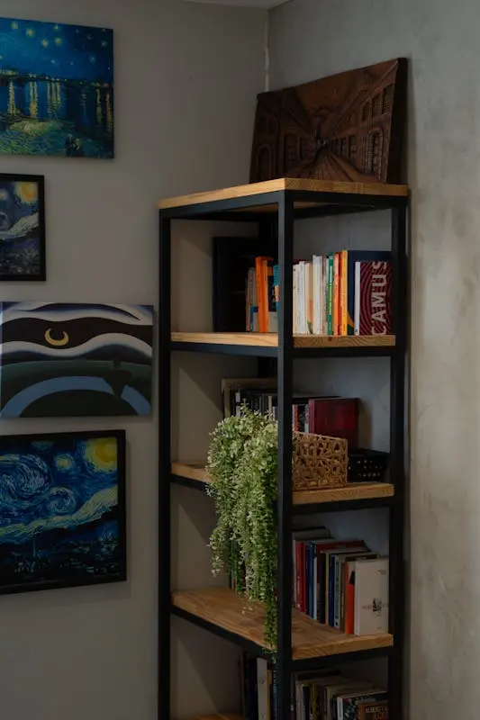
H2: How to Style Shelves: The 60-30-10 Formula
Once the shelves are up, the real work starts. This is where most people get stuck and either overcrowd every inch or leave them so empty they feel cold.
My go-to formula for styling living room shelving ideas is 60-30-10.
- 60% Books
- 30% Decor
- 10% Negative space
Let’s break that down.
60% Books
Books are your best styling tool and your easiest one. I like a mix of:
- Vertical rows (spines together) for structure.
- Horizontal stacks for variety and to act as mini “pedestals” for candles or small objects.
Try to group books by height or by colour family rather than randomly. It’s not about perfection; it’s about avoiding visual chaos.
30% Decor
This is where you add personality without junking up the shelves. Think:
- Bowls, boxes and baskets (for hiding remotes, cables, cards).
- Simple ceramics, framed photos, small plants.
- One or two larger pieces per shelf rather than lots of tiny things.
In my experience, a single strong object looks more expensive than five little trinkets trying to do the same job. If you’re unsure, size up rather than down.
10% Negative Space
Negative space is the most underrated part of styling. It’s the empty part of the shelf.
Leave some areas completely clear — no book, no vase, nothing. This gives the eye a place to rest and stops the unit from feeling stuffed. It also makes the pieces you do have look more intentional.
The “Z” Method
To make everything feel cohesive, I use what I call the “Z” method:
- Imagine drawing a zigzag “Z” from the top left of your shelving to the bottom right.
- Repeat colours or materials roughly along that path.
For example, if you have a terracotta pot on the top left, place another warm terracotta or rust-coloured piece somewhere in the middle, then a third toward the bottom right. Your eye automatically follows that path, and the shelves feel designed rather than random.
Use the same logic with metallics, black accents, or greenery. Echo each element at least three times in different spots so nothing feels isolated.
Solving Layout Nightmares
Living room shelving doesn’t live in a vacuum; it has to work with TVs, fireplaces, and awkward corners. Here’s how I approach the most common problem areas.
The “TV Wall”
Most people shove a TV on a slim stand and then wonder why the wall feels empty and unbalanced.
What I prefer instead:
- A hybrid wall: closed base cabinets across the full width, with open shelving above either side of the TV. This makes the TV feel like part of a wider composition instead of a lonely black rectangle.
- Painting the wall behind the TV slightly darker than the rest of the room so the screen visually recedes.
If you’re adding shelves around a TV, keep those immediately flanking it fairly calm: books and simple objects in cohesive colours, not a busy mix that competes with whatever’s on the screen.
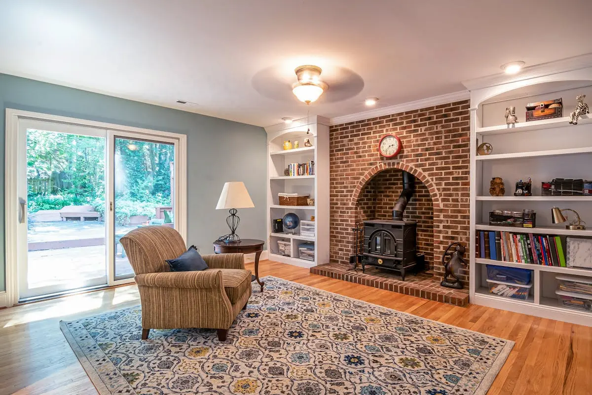
The “Chimney Breast”
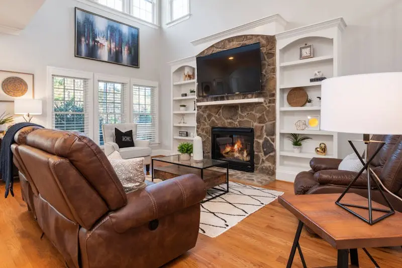
In older homes you often get a central chimney breast with shallow alcoves on each side. These are perfect opportunities, but they’re often wasted.
My rule of thumb:
- Match both sides for symmetry, even if one side has a doorway nearby.
- Use built-ins or well-fitted freestanding units that go wall-to-wall in each alcove so the whole fireplace wall reads as one composition.
You can play with contrast: for example, closed cabinets in the alcoves with a simple shelf above the fireplace, or full bookshelves in the alcoves and a large piece of art above the mantel. The key is to treat the whole wall as a single design problem, not three separate ones.
The “Awkward Corner”
Every living room has that corner — too narrow for a chair, too visible to ignore.
A few approaches I like:
- Wrap-around corner shelves that turn the corner and create a small “tower” of storage. Keep them shallow so they don’t feel intrusive.
- A tall, narrow shelving unit that echoes the height of the room and uses the space vertically rather than jutting into the floor area.
- If the corner is near a sofa, a small shelf stack at arm height can double as a side table for books, cups and a lamp.
The goal with awkward corners is to turn them into intentional moments: a mini library, a plant corner, or a display niche — never a dumping ground.
If you take nothing else from this, remember this sequence:
- Decide which type of shelving you actually need (built-in, floating, modular, partition).
- Respect basic measurements so everything fits and doesn’t sag.
- Style with 60-30-10 and a little negative space so it feels curated instead of cluttered.
Do that, and your living room shelves will stop being random planks of wood and start acting like what they should be: the backbone of your storage, your style, and the whole room’s structure.