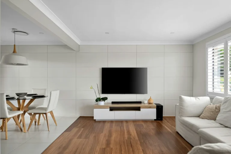
Neutral Living Room Ideas: How To Make Beige Look Expensive, Not Boring
Most “neutral living rooms” look like someone turned the saturation slider to zero and gave up. Flat beige walls, flat beige sofa, flat beige rug.
Yet the high-end neutral spaces you see in Elle Decor feel layered, warm and quietly expensive. Same color family, completely different result. That gap is what we’re fixing here.
In this guide, we’ll unpack neutral living room ideas that actually work in real homes: choosing warm neutral paint colors for 2026, dealing with metamerism in paint, and using texture layering in interior design so your room feels intentional instead of empty. I’ll keep it practical and opinionated, not textbook.
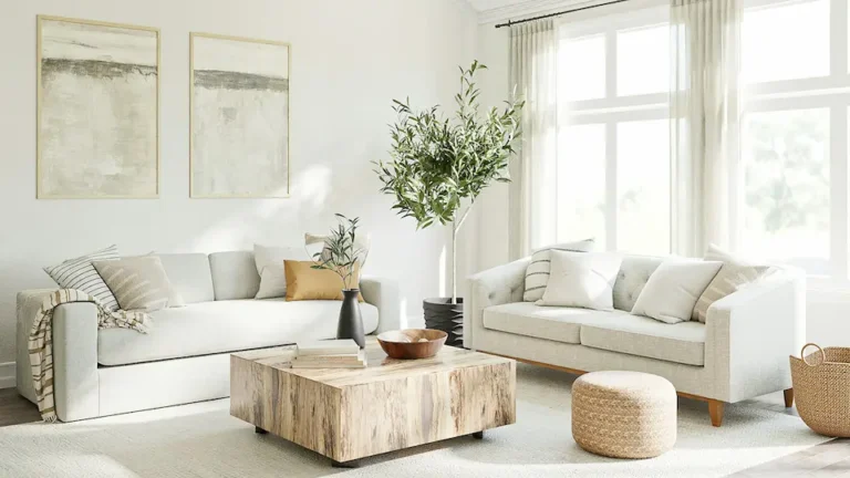
The 3 Pillars of a High-End Neutral Room
Neutral doesn’t mean “no design”. It just means your tools shift from bright color to texture, contrast and materials. If you remember these three pillars, you’ll avoid the “rental beige” trap.
1. Texture > Color
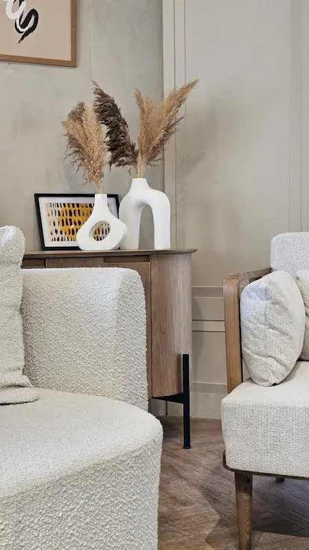
Once you strip out strong color, texture becomes the color. That’s why magazine rooms full of whites and creams still feel rich.
Use a mix of:
- Bouclé on a curved sofa or accent chair for that nubby, tactile moment.
- Travertine on a coffee table or side table for a soft, chalky stone look.
- Limewash on the walls to add movement and depth instead of flat emulsion.
- Raw silk or linen on cushions and curtains for a dry, matte sheen.
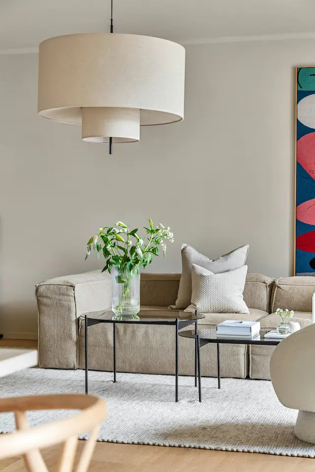
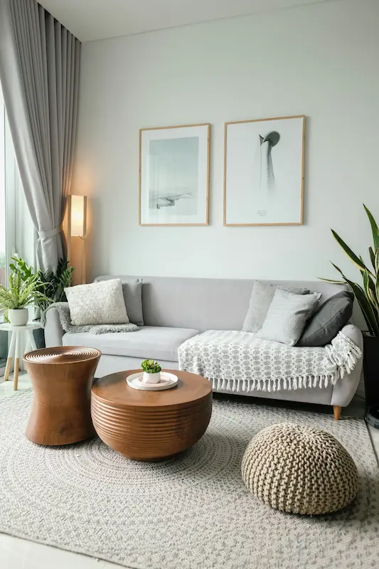
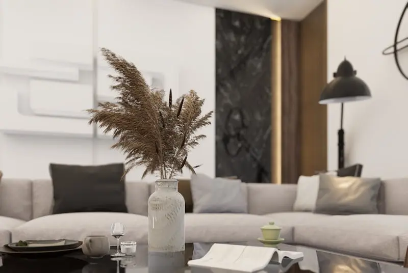
In my experience, if your living room feels flat, you don’t need more cushions; you need more contrast in texture. Pair something rough with something smooth in every vignette: jute next to velvet, bouclé next to a sleek metal floor lamp, stone next to soft wool.
2. The Contrast Rule
All-neutrals with zero contrast look like a room that hasn’t “loaded” yet. You need anchors.
Anchors can be:
- Black window frames or black cabinet hardware.
- A dark wood sideboard in walnut against lighter walls.
- A charcoal throw or accent chair in a sea of creams.
Those darker moments stop everything from feeling floaty. I like to think in ratios: 70% light neutrals, 20% mid-tones, 10% dark accents. That 10% is where your room gets its structure.
If you’re nervous about black, start small with a black iron floor lamp base, a picture frame, or a low-profile black coffee table frame under a pale stone top.
3. The Biophilic Connection
Neutrals feel expensive when they feel natural, not plastic. That’s where biophilic design quietly does the heavy lifting.
Leaning into:
- Stone (travertine, marble, limestone) for tables and trays.
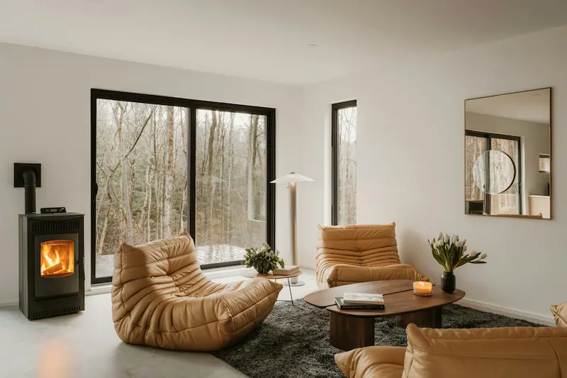
- Wood (oak, walnut, ash) for furniture and shelving.
- Clay for vases and planters.
These materials age well and pick up subtle patina, which looks far better than shiny plastic as the years go by. Even a simple clay pot with a leafy plant will do more for a neutral room than five generic ornaments.
If you’re on a budget, I’d rather you buy fewer pieces in genuine natural materials than a lot of faux everything. One real travertine side table can lift an entire seating area.
Mastering Undertones (The Secret to Neutrals)
Color names like “Linen” and “Cloud” don’t tell you anything. Undertone does. This is where most neutral living room ideas fail: the walls go lilac at night, or the sofa suddenly looks yellow next to the rug.
The “Metamerism” Effect
Metamerism in paint is the reason your “perfect beige” shifts throughout the day. The same paint can look cool in morning light and warm under artificial light. Different light sources bring out different undertones.
Here’s how to manage it:
- Always test large swatches on at least two walls in the room (one facing the window, one away from it).
- Look at them at three times of day: morning, afternoon, evening with lamps on.
- Place a sheet of plain white paper next to the swatch. If the paint suddenly looks pink, green or yellow by comparison, that’s the undertone revealing itself.
If your living room has cool daylight (north-facing in many regions), a slightly warmer neutral will balance it. If you get very warm, golden light, a neutral that is too yellow can turn muddy by sunset.
You don’t need to memorize color theory; you just need to observe your samples across time and lighting.
The 2026 Palette (Beyond Grey)
For warm neutral paint colors in 2026, we’re firmly out of the cold grey era. The most forgiving, timeless tones I keep circling back to are:
- Mushroom / Taupe: A soft, earthy base that sits between grey and brown. It’s more forgiving than pure beige and plays nicely with both warm and cool accents.
- “Salted Caramel” Neutrals: Not orange, not tan, but a gentle caramel that adds warmth without screaming “feature wall.” I like these for niches, media walls or behind shelves.
- Pale Sage: A very soft green that almost reads as a neutral. It works beautifully with wood, travertine and black accents and feels calming without going full “green room”.
In practice, I recommend picking one main wall colour (mushroom/greige), then using a slightly deeper version of the same family for an accent (like the fifth wall or a niche). That keeps things tonal rather than patchwork.
How to Layer a Neutral Room (Step-by-Step)
Think of your living room as a stack of textures from the ground up. If you hit at least three layers well, the room will feel designed, not default.
Layer 1: Floors (Matte Base)
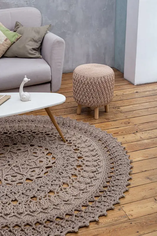
Start with a jute or wool rug.
- Jute or sisal gives you a dry, earthy base with lots of texture.
- Wool (especially in a loop or subtle pattern) feels softer and is kinder to bare feet.
For neutral rooms, I almost always recommend oversized rugs. When the rug is too small, the furniture looks like it’s hovering in separate islands. A larger rug unifies the scheme and makes all those neutrals feel deliberate.
Layer 2: Furniture (Soft Touch Points)
On top of that base, bring in upholstery that contrasts in texture:
- Linen sofas or armchairs for a relaxed, breathable look.
- Velvet for depth and a slight sheen in more formal or cozy spaces.
Mixing both is often more interesting than choosing just one. A linen sofa with velvet cushions and a bouclé accent chair gives you three fabric textures in one glance.
Layer 3: Surfaces (Hard/Glossy Moments)
Next, add marble or travertine for coffee tables, side tables or console tops.
Stone keeps a neutral room from feeling like it’s made entirely of fabric. It also reflects light in a softer way than glass, which can sometimes feel cold.
If solid stone isn’t in the budget, look for stone-topped tables or even a single travertine tray on a wooden coffee table. The principle is the same: mix matte and subtle gloss.
Layer 4: Accents (Metallic + Detail)
Finally, layer in metal:
- Aged brass for warmth and a slightly traditional touch.
- Black iron for a modern, graphic line.
Use metals on lamp bases, curtain rods, small side tables, and hardware. I like to pick one main metal and repeat it around the room instead of mixing too many.
The Texture Checklist
Before you call the room done, do a quick audit. You want at least three distinct textures visible from the main seating spot. For example:
- Jute rug + linen sofa + travertine table.
- Wool rug + bouclé chair + aged brass floor lamp.
If everything you can see could be described as “smooth and flat”, you’re not finished yet.
The Best Furniture for Neutral Spaces
Choosing furniture for neutral living room ideas isn’t about avoiding color; it’s about doubling down on shape and material.
The “Statement” Sofa
In a neutral room, the sofa becomes your main sculptural piece.
I like:
- A curved bouclé sofa to soften straight walls and add a high-end, gallery feel.
- Simple, low-profile legs so it still feels light rather than bulky.
If a curved sofa isn’t practical for your space, go for a clean-lined sofa in a textured fabric and let the coffee table or accent chairs carry the curves instead.
Mixing Wood Tones (Walnut + Oak)
You don’t need to match every wood finish. In fact, that can look flat and “set-like”. The trick is matching undertones, not exact colour.
- Walnut usually reads as deeper and warmer.
- Oak tends to be lighter and can lean either warm or slightly ashy.
To mix them:
- Choose one as your dominant wood (for the biggest pieces).
- Introduce the second wood in smaller doses: side tables, frames, shelving.
- Make sure both woods share a similar undertone (both warm, or both slightly cool).
If one piece looks oddly orange or red next to everything else, that’s your cue that the undertones are fighting.
Rug Sizing: Why Oversized Matters More in Neutral Rooms
In a colourful room, your eye is distracted by prints and artwork. In a neutral room, scale mistakes are very obvious.
An undersized rug:
- Makes furniture look like it’s floating separately.
- Emphasizes the empty floor around it, which can make the room feel cold.
Aim for a rug large enough that at least the front legs of all seating sit on it. In open-plan spaces, an oversized neutral rug can quietly zone the living area without needing more furniture or walls.
If you’re torn between two rug sizes, I almost always recommend the larger one, as long as it doesn’t run right up to built-ins or radiators.
Troubleshooting: “My Room Looks Boring”
If you’ve already painted everything beige and bought the neutral sofa, don’t panic. You don’t have to start again. Adjust the layers.
Solution A: Add a “Living Wall”
Plants are the quickest way to break up monotony.
- Use one taller plant (like a tree-form plant in a simple pot) to add height.
- Layer smaller plants on shelves or a console in front of a neutral wall.
The green reads as a soft accent colour and reinforces that biophilic connection. Even in a very tonal room, the eye loves a bit of life.
Solution B: Paint the Fifth Wall
If the room feels washed out, look up.
Painting the ceiling a slightly darker shade of your wall colour can:
- Make a high room feel cozier and more intimate.
- Add visual interest without introducing a totally new colour.
I prefer going just one or two steps deeper on the same paint card rather than jumping to a different hue. It feels sophisticated and still very neutral.
Solution C: Add Shadow, Not Color
If you want more depth without brighter colour, focus on shadow lines. That’s where wall molding and paneling come in.
Simple trims, picture-frame molding, or shallow slatted panels create natural highlights and shadows as light moves across the wall. You can paint everything the same neutral; the depth comes from the relief, not from changing colours.
This is especially effective behind a sofa or on a TV wall where a plain expanse can feel empty.
3. The “Secret Sauce” (Differentiation)
Here’s how your version of neutral living room ideas quietly beats what big magazines and generic blogs offer:
| Competitor Feature | Your Upgrade (The “GEO” Differentiator) |
|---|---|
| Furniture Choice: “Buy a beige sofa.” | You: “Buy a performance fabric sofa in an oatmeal or greige tone so it actually survives daily life.” |
| House Beautiful: “Warm neutrals are in.” | You: Run the undertone test: hold white paper against the wall or sofa to see if it shifts pink, yellow, or green before committing to cushions and rugs. |
| Elle Decor: “Sophisticated layering.” | You: Talk about limewash and plaster. These textured wall finishes are peak 2026 for neutral spaces and add instant depth without stronger colour. |
This is the difference between copying a look and understanding how to build it from the ground up.
4. Entity & Keyword Checklist
If you’re creating your own moodboard or briefing a designer, sprinkle these materials and concepts through your plan. They’re the backbone of sophisticated neutral living room ideas.
Materials to consider
- Travertine
- Bouclé
- Shearling
- Jute
- Sisal
- Unlacquered brass
- Limewash
- Tadelakt-style or plaster finishes
Concepts to keep in mind
- Monochromatic schemes
- Tonal layering
- Negative space (leaving some areas intentionally empty)
- LRV (Light Reflectance Value) when choosing paint
- Warm minimalism
Colour families worth exploring
- Greige (grey + beige)
- Taupe
- Ecru
- Alabaster-style soft whites
- Charcoal as a controlled accent
You don’t need all of these; you just need a consistent story.
5. Visual Strategy
If you’re planning content around neutral living room ideas, or just trying to visualise your own space, here’s how I’d frame it.
The “Undertone Wheel”
Create a simple visual (even just for yourself on paper) that shows:
- Cool whites shifting towards blue and green.
- Warm whites shifting towards yellow and pink.
Then mark where your chosen wall colour sits. This helps you choose textiles and woods that share or complement that undertone instead of fighting it.
Texture Close-Ups
Don’t just judge the room from one wide-angle view. Take “snapshots” of:
- A linen cushion against a leather chair.
- A bouclé sofa next to a travertine table.
- A jute rug under a black iron floor lamp.
If each close-up feels rich and intentional, the whole room will, too. If a close-up looks flat, adjust that specific corner with more texture, contrast, or a natural material.
If you remember nothing else, remember this: neutrals aren’t the “easy option” — they’re the unforgiving option. But once you understand undertones, texture layering, and contrast, your neutral living room stops looking safe and starts looking quietly luxe.