Warm White Kitchen Decor 2026: How to Layer “The New White”
White kitchens aren’t going anywhere in 2026 – but the cold, high-gloss, showroom white absolutely is.
The new wave is warm white kitchen decor: layered creams, parchment tones, and soft bone whites that feel bright, calm, and genuinely lived in. Think less “surgical lab,” more “sunlit bakery where you actually want to sit and eat”.
In this guide, I’ll walk you through exactly how to transition from sterile to soft, using smart paint choices, texture, and contrast. Think of it as your Warm White Kitchen Decor 2026: The Anti-Sterile Design Guide – focused on depth, temperature, and materials, not just another coat of paint.
The “Texture Over Color” Rule
If your white kitchen feels flat or cold, you don’t actually need more color first. You need more texture.
White is unforgiving when it’s perfectly smooth and perfectly glossy. As soon as you add variation – in the tile surface, the wood grain, the textiles – the same white suddenly looks expensive and intentional.
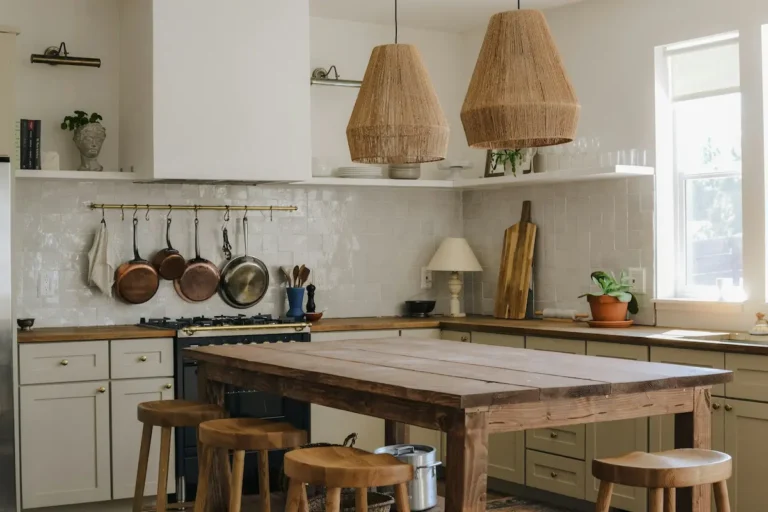
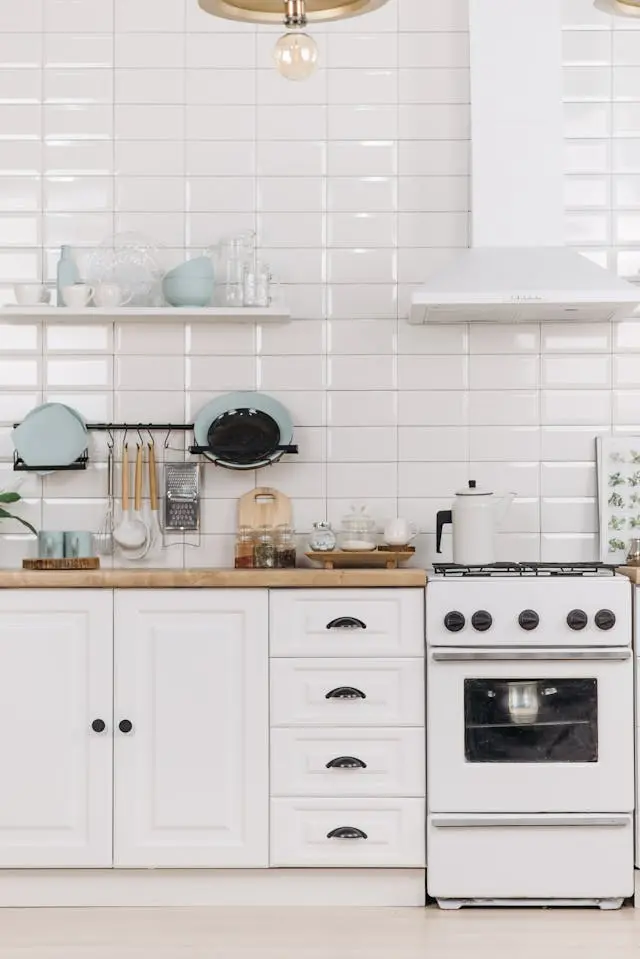
The Backsplash Upgrade
If I could change just one thing in a tired white kitchen, it would be the backsplash.
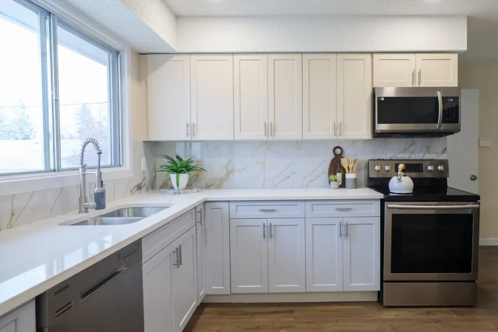
Most builder kitchens still use flat, machine-perfect white subway tile with bright white grout. It is technically “fine,” but under strong LED lighting it reads as harsh and a bit clinical.
Instead, look for:
- Zellige tiles (handmade clay tiles)
- Glazed brick or brick-style tiles
- Beveled or lightly irregular subway tiles
What matters here is not just the color, but the imperfection.
Why this works:
- The slightly uneven surface bounces light in different directions, so your walls are no longer one flat sheet of white.
- Micro-shadows between tiles create depth even if everything is still “white”.
- You get that “old European kitchen” character without committing to bold color.
Practical tips:
- Choose off-white or cream Zellige, not stark blue-white.
- Go for a satin or glossy glaze on the wall – it will catch the light beautifully.
- Pair with a warm grout: look for names like “Alabaster”, “Bone”, or “Warm Grey”. Avoid dark charcoal unless you want a graphic, industrial look.
Countertop Styling
You can have the most beautiful quartz or marble in the world – if the surfaces are either cluttered or completely empty and shiny, the kitchen will still feel off.
Your counters are where you soften the “white box” and make it human.
Use fewer, bigger items:
Instead of 10 small decor pieces, I recommend 3 or 4 generous, functional objects:
- One or two large wooden bread boards (propped against the backsplash)
- A heavy ceramic crock with everyday utensils
- A stone or wood pedestal holding fruit or daily essentials
Why I like this approach:
- Wood boards introduce grain and warmth that instantly soften white stone.
- A big crock looks intentional; a jar here and a jar there looks like clutter.
- Larger items mean fewer visual “bits” for your eye to process – the space feels calmer.
If your kitchen currently feels sterile, don’t start buying colorful trinkets. Start by adding just one beautiful wooden element on each major counter run and build from there.
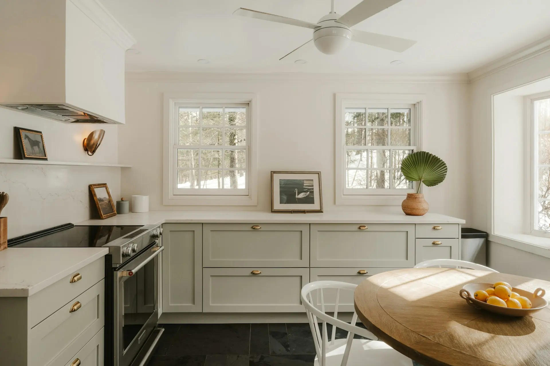
The “Jewelry” of the White Kitchen (Hardware)
Hardware is where a white kitchen quietly tells you whether it’s budget or elevated.
Unlacquered Brass
In my experience, the fastest way to make warm white cabinets feel expensive is to switch from cool chrome to warm, “living” metals – especially unlacquered brass.
Why I love unlacquered brass in warm white kitchens:
- It patinas over time – small marks, subtle darkening around the handles. That aging sits beautifully against creamy cabinets and makes the space feel collected, not brand new and empty.
- It adds micro contrast without shouting. On camera, it reads as soft gold, not bling.
- It pairs seamlessly with wood stools, woven shades, and warm lighting.
If unlacquered brass isn’t available where you are, look for finishes called:
- “Brushed brass”
- “Antique brass”
- “Champagne bronze”
They all sit comfortably with cream and off-white; just avoid anything labeled “yellow gold” or very shiny. High shine plus white tends to slide back to “glam hotel lobby”.
The “No-Hardware” Look
On the opposite end of the spectrum, modern Japandi-inspired kitchens are dropping visible hardware entirely:
- Integrated J-pull handles
- Cut-out finger pulls in the cabinet doors
- Push-to-open latches for base cabinets and tall pantries
This works beautifully if:
- Your kitchen is more minimal and architectural.
- You’re using very soft, warm whites and letting the cabinet lines themselves be the “design”.
In that case, your “jewelry” becomes:
- The curve of the island
- The stone veining
- The texture of your backsplash
If you’re not renovating cabinets but want a similar effect on a budget, you can:
- Choose tiny, low-profile knobs in a finish close to the cabinet color.
- Keep hardware consistent throughout – same finish, same shape – for a calmer, more deliberate look.
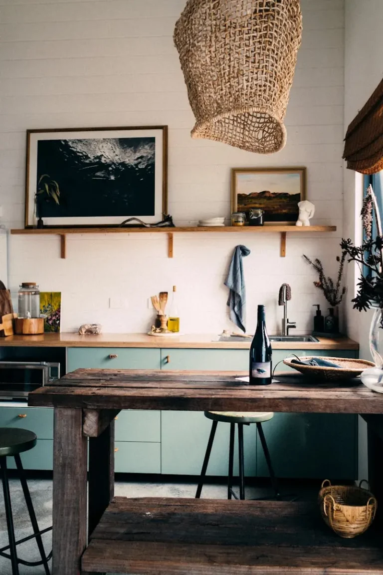
Breaking the White: 3 Contrast Points
A truly successful warm white kitchen is not all white. It’s white plus 2–3 supporting players that ground it.
1. The Floor Runner
The floor is where you can really correct that “floating cabinetry” feeling.
My rule of thumb:
If the kitchen is mostly white and light, the rug should carry depth – not more grey and white.
Instead of a flat grey mat, I prefer:
- A vintage-style Persian or Turkish runner with:
- Deep reds
- Rust, terracotta, or brown
- Pattern that can hide stains
- Or a jute/wool blend runner with visible texture if you want something more neutral.
This does three things:
- Grounds the run of white cabinets.
- Adds pattern so you don’t need busy backsplash or wallpaper.
- Makes the room feel warmer underfoot, especially if you have cold tile.
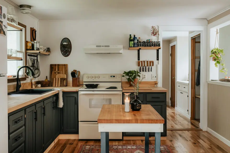
2. Mixed Woods
White + wood is still one of the most timeless combinations, but the type of wood matters.
For warm white kitchen decor, I generally recommend:
- White oak: light, desaturated, soft grain
- Walnut: deeper, chocolate-brown with beautiful movement
Use wood strategically as “contrast anchors”:
- Open shelves in white oak
- Walnut bar stools at a white island
- A wood top on a small bistro table in the kitchen
Let the wood grain act as your pattern. Once the wood is in, you can keep everything else (like towels and ceramics) very simple.
Avoid:
- Orange “honey oak” against cool white – it instantly dates the space.
- Too many wood tones fighting each other. Two is usually enough: one light, one dark.
3. One Dark Accent Zone
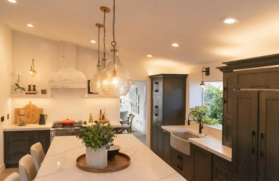
To keep a warm white kitchen from feeling washed out, I like introducing one deliberate darker element, such as:
- A contrasting island in deep taupe, greige, or charcoal
- A range hood surround in a darker plaster or paint
- A window frame or interior door painted in a soft black or very dark brown
This is where your secondary keyword comes in: when clients ask about cream vs white kitchen cabinets, I often suggest:
- Cream or warm white on the main run of cabinets
- A slightly darker neutral (like a mushroom or greige) on the island or pantry
It creates subtle definition without clashing.
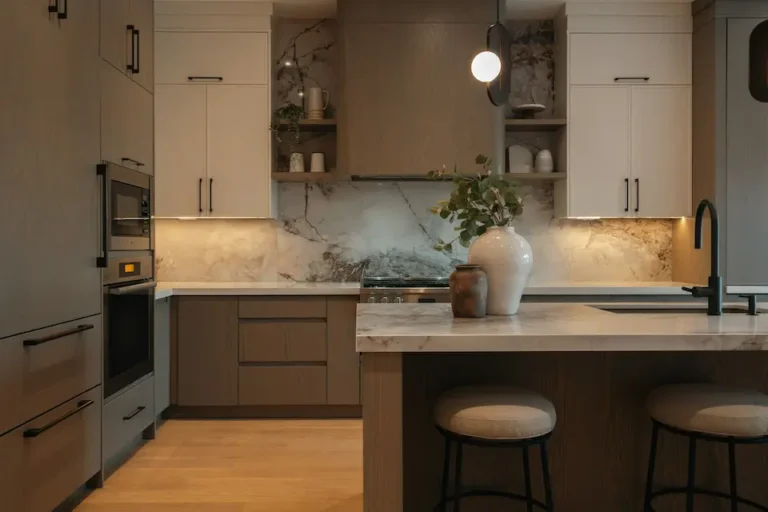
Paint It Right: The 2026 White Palette
Choosing the right white is where most people get stuck – and I understand why. On a screen, they all look the same. In real light, they really don’t.
Think of whites in two broad families:
The “Cool” Whites (Use With Caution)
Cool whites have blue or grey undertones. They look crisp, modern, and sharp.
Typical examples (depending on your region/brand):
- “Chantilly Lace”–type colors
- “Decorator’s White”–type colors
Where they work:
- Ultra-modern, minimal spaces with lots of direct sunlight
- Paired with cool metals (polished chrome, stainless) and very little wood
Where they fail:
- North-facing rooms or low-light apartments – they can look flat and icy.
- When combined with warm floors or warm counters, they can make everything else look dirty or yellow.
In 2026, I wouldn’t choose a very cool white for a family kitchen unless you are deliberately going for a gallery-like, minimal look and you know your light is perfect.
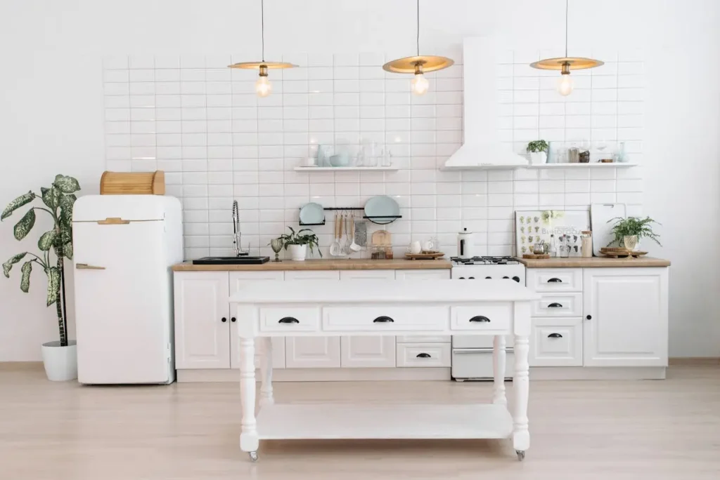
The “Warm” Whites (The 2026 Standard)
Warm whites carry yellow, beige, or very soft greige undertones. They are the heroes of warm white kitchen decor.
Typical warm white families:
- Soft “coffee with milk” whites
- Creamy whites that still read as “white” rather than beige
Why I prefer them in kitchens:
- They play nicely with wood floors, brass hardware, and woven textures.
- They’re more forgiving under artificial light – they won’t suddenly look blue at night.
- They make stainless appliances feel softer instead of stark.
Pro tip on finishes:
- Walls: Flat or matte – hides imperfections and gives a soft backdrop.
- Trim and doors: Same color, but in satin or semi-gloss – this creates subtle contrast and makes trim feel more architectural.
- Ceilings: Either the same warm white as walls in flat, or 0.5–1 shade lighter if your room is low and you want a bit of lift.
Painting walls, trim, and ceiling in the same family of white is an easy way of “color drenching” with white – the boundaries blur, which is especially beautiful in smaller kitchens.
Cream vs White Kitchen Cabinets: What Actually Matters
Let’s tackle this directly, because it comes up in almost every consultation.
The question is not “cream vs white kitchen cabinets”. It’s:
“What does my room’s light and flooring do to cream or white?”
A quick framework:
- If your floors are cool (grey tile, light ash wood), a very creamy cabinet can read too yellow next to them. In that case, go for:
- A soft white with a very subtle warm undertone.
- If your floors are warm (honey oak, warm beige tile), a very cool white can make the floor look orange and dated. In that case, go for:
- A cream or warm white that bridges the floor and counters.
In my experience, the safest route for 2026 is:
- Warm white or cream cabinets
- A softer, warm white on the walls
- Natural wood somewhere in the mix to tie everything together
If you already have bright white upper cabinets you can’t change, consider:
- Painting only the lower cabinets a warmer neutral (mushroom, greige) to soften the contrast.
- Or adding texture – fluted panels on an island, new warm hardware – to distract from the cool upper tone.
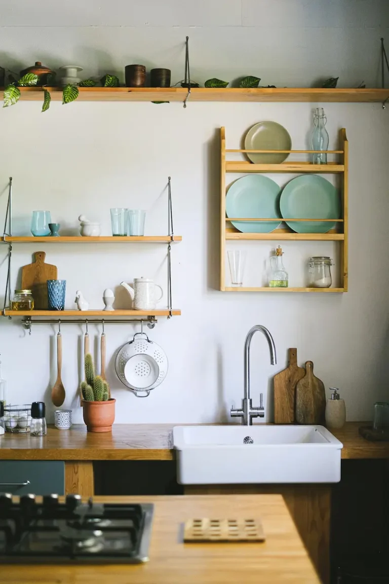
Adding Texture to a White Kitchen (Without Making It Busy)
Texture is your best friend when you want warmth without a lot of color.
Here’s a quick mini-checklist you can use:
| Area | What You Probably Have Now | 2026 Warm Upgrade |
|---|---|---|
| Backsplash | Flat subway tile | Zellige, glazed brick, or handmade-look tile |
| Flooring | Smooth tile or laminate | Add a vintage runner or jute rug |
| Hardware | Shiny chrome handles | Brushed or unlacquered brass, soft black |
| Windows | Bare or white plastic blinds | Linen Roman shade or simple fabric curtain |
| Open shelves | Matching white dishes only | Mix white ceramics, wood boards, glass jars |
You don’t need to do everything at once. Even two of these changes can transform the overall feel.
Frequently Asked Questions (FAQ Schema)
Is the all-white kitchen out of style in 2026?
The harsh, super-glossy, blue-white kitchen is fading fast. But white kitchens themselves are not “out” – they’re simply evolving.
In 2026, the look is:
- Warm whites and creams
- Textured, imperfect surfaces
- Organic materials (wood, stone, woven pieces)
So if you love white, keep it. Just shift from “clinical” to layered and tactile.
How do I add color to a white kitchen without painting the cabinets?
You have plenty of options that don’t involve a roller:
- Window treatments: Linen Roman shades or cafe curtains in warm neutrals, sage, or soft stripes.
- Flooring: A patterned runner with rust, olive, or navy tones.
- Textiles: Tea towels, seat cushions, and oven mitts in cohesive colors.
- Small appliances: A pastel or muted-tone toaster, kettle, or mixer that stays out on the counter.
The trick is to stay within one tight palette (for example: cream + terracotta + deep brown) rather than lots of random colors.
What color grout should I use with white tile?
If you want a classic, warm look:
- Choose a grout labeled “Warm Grey,” “Linen,” “Biscuit,” or “Bone.”
- This hides everyday marks and gives a soft, timeless outline to the tile.
I rarely recommend pure white grout in a kitchen (stains too quickly), and I almost never recommend jet black grout with white tile anymore – it can feel dated and too industrial in an otherwise warm space.
Conclusion
A warm white kitchen isn’t about chasing the latest trending paint name. It’s about understanding how light, undertones, and texture work together in your specific space.
If you remember nothing else, keep these three ideas:
- Texture over color – choose imperfect tiles, visible wood grain, and tactile textiles.
- Warm, layered whites – pick whites with gentle warmth and repeat them across walls, trim, and ceiling.
- Ground the scheme – add contrast with rugs, wood, and one deeper accent so the room doesn’t disappear into itself.
A white kitchen is the canvas, not the finished painting. The warmth comes from what you layer onto it.
If you’d like to go deeper, your next step could be to create a mini mood board: one warm white paint, one backsplash, one wood tone, one rug. When those four elements feel harmonious, the rest of the decisions fall into place.